Need a logo for a cool new belt brand, FreeBelts
Want to win a job like this?
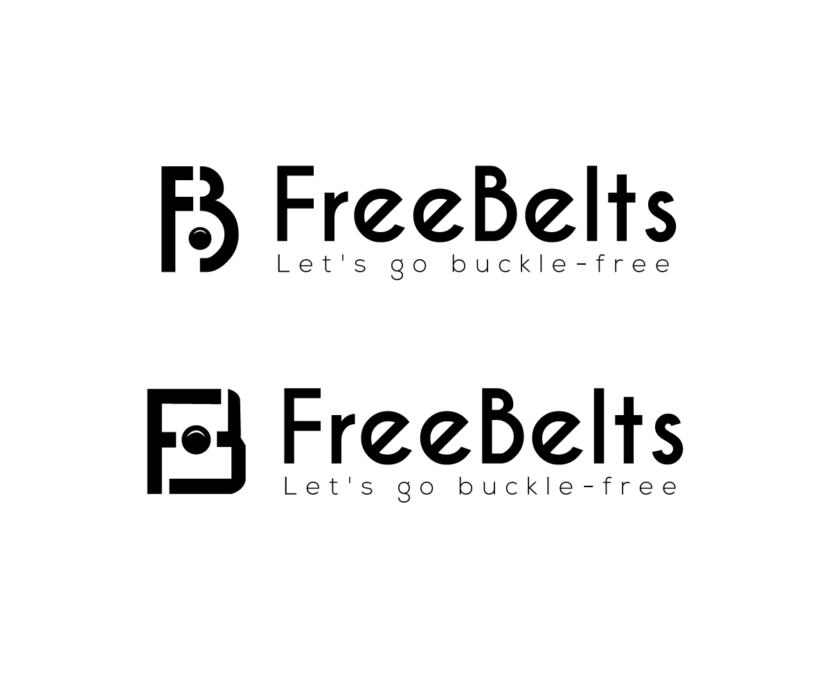
This customer received 152 logo designs from 41 designers. They chose this logo design from srinup9492 as the winning design.
Join for free Find Design Jobs- Guaranteed
-
 US$150
-
 152 designs
-
 41 designers
Logo Design Brief
Brandname: FreeBelts (should be stylized like this, with F and B in caps)
Product: (Indiegogo) igg.me/at/freebelts (Amazon) goo.gl/K6CsBi
It is a creative invention, buckle-free belt. Wish the “Freeing” “Simple” “Minimal” elements show.
I don’t like the somewhat “childish” tone of the Indiegogo page and our website. Trying to redesign our website into this kind of simple tone http://www.sixshop.com/template-simplicity/home.
Want a logo either :
- Simple and minimal. Well made.
- Young, cool, and casual. (to a point where it’s not childish or cheap)
1 “FreeBelts” logo, we’ll use with our without “Let’s go buckle-free” tagline under it.
2. A simple mascot/pictoral symbol to use with the logo, or F (or FB) stylized—to be used as Favicon and social media profile, etc.
Some of the DIY logos we tried, and other logos we liked for your reference are attached.
Target Market(s)
The product really has a broad, mass appeal. We currently have more men customers than women. But we're going to start marketing the kids line too, so mothers will be an important target customer group also.
Industry/Entity Type
Fashion
Logo Text
FreeBelts (tagline optional: Let's go buckle-free.)
Logo styles of interest
Pictorial/Combination Logo
A real-world object (optional text)
Wordmark Logo
Word or name based logo (text only)
Font styles to use
Look and feel
Each slider illustrates characteristics of the customer's brand and the style your logo design should communicate.
Elegant
Bold
Playful
Serious
Traditional
Modern
Personable
Professional
Feminine
Masculine
Colorful
Conservative
Economical
Upmarket
Requirements
Must have
- The brand name “FreeBelts” and “Let’s go buckle-free” tagline. The brand image of Simple, minimal, well made, cool. Want the brand name to be readable (no 'too fancy' fonts)
Nice to have
- A simple mascot/pictorial symbol to use with the logo, or F (or FB) stylized—to be used as Favicon and social media profile, etc.
Should not have
- Don't want it to look too young or cheap. No excessive decorative elements. No gender specific feel--it's unisex.