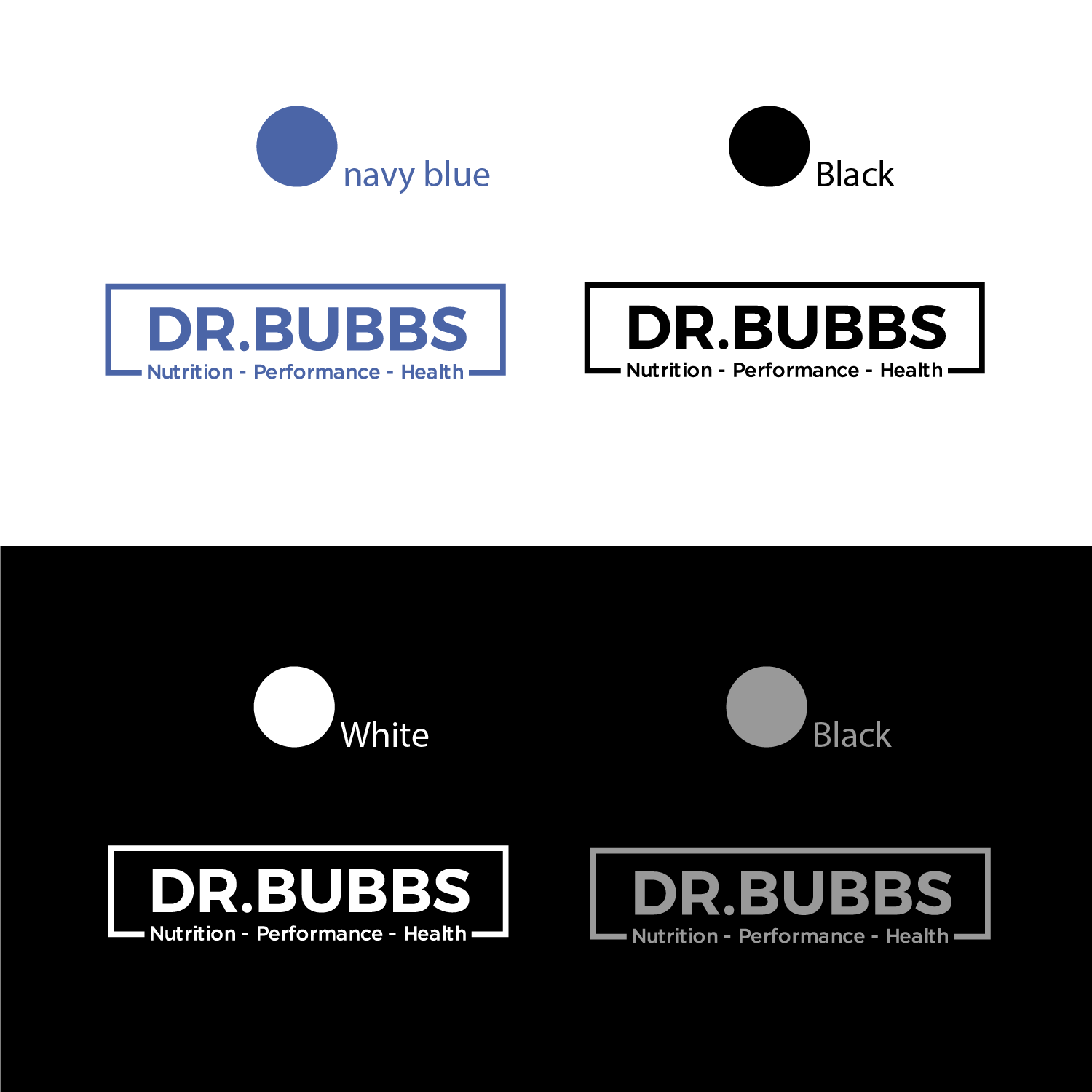
Doctor, Speaker, Nutritionist needs an updated logo to more clearly define his target audience

Want to win a job like this?
This customer received 91 logo designs from 31 designers. They chose this logo design from Decos Studio as the winning design.
Join for free Find Design Jobs- Guaranteed
Logo Design Brief
I work as a doctor, speaker and sport nutritionist in high performance (i.e. profressional sport) as well as working in clinical practice as a physician using primarily diet, exercise and lifestyle interventions to help clients lose weight, fight off diabetes, hypertension, high cholseterolet, etc...
I've actually got a very good idea of what I want... and i've included the materials below.
The top picture is the design I would like to have... capital letters on the top, and lower case (i.e. cursive, not cursive, whatever) on the bottom. You can play around with colouring and perhaps fonts, but I deal with professional sports team and executives, so I would to keep it classy.
I like the line on the left and have included a symbol (bottom of attachment). It represent a "reversible reaction" in chemistry and translates to being able to reverse chronic diseases, injury, poor athhletic performance, etc.
You can disregard the object on far left of sample logo.
I open to ideas/tweaks to the basic structure of the logo, but would like to keep it to something in this genre
Target Market(s)
doctors, strength coaches (college and profressional sport teams), medical profressionals (chiros, phsyio, etc.) personal trainers, avid exercisers, etc.
Industry/Entity Type
Nutrition
Logo Text
DR BUBBS (top line) Nutrition. Performance. Health. (bottom line)
Logo styles of interest
Wordmark Logo
Word or name based logo (text only)
Font styles to use
Look and feel
Each slider illustrates characteristics of the customer's brand and the style your logo design should communicate.
Elegant
Bold
Playful
Serious
Traditional
Modern
Personable
Professional
Feminine
Masculine
Colorful
Conservative
Economical
Upmarket
Requirements
Must have
- Similar basic structure to the "sample" I sent over.
- Exact (or close to exact) wording -
- DR BUBBS (top line - Sans Serif)
- Nutrition. Performance. Health. (can be serif, cursive, whatever works...)
Nice to have
- subtle differences in fonts, colouring, use of and colouring of double arrows... creative within constraints of example I provided.
Should not have
- you can throw a 'hail mary' and have a totally different design, if you REALLY feel it fits my target market