Web Site Redesign for Transpireinc.com
Want to win a job like this?
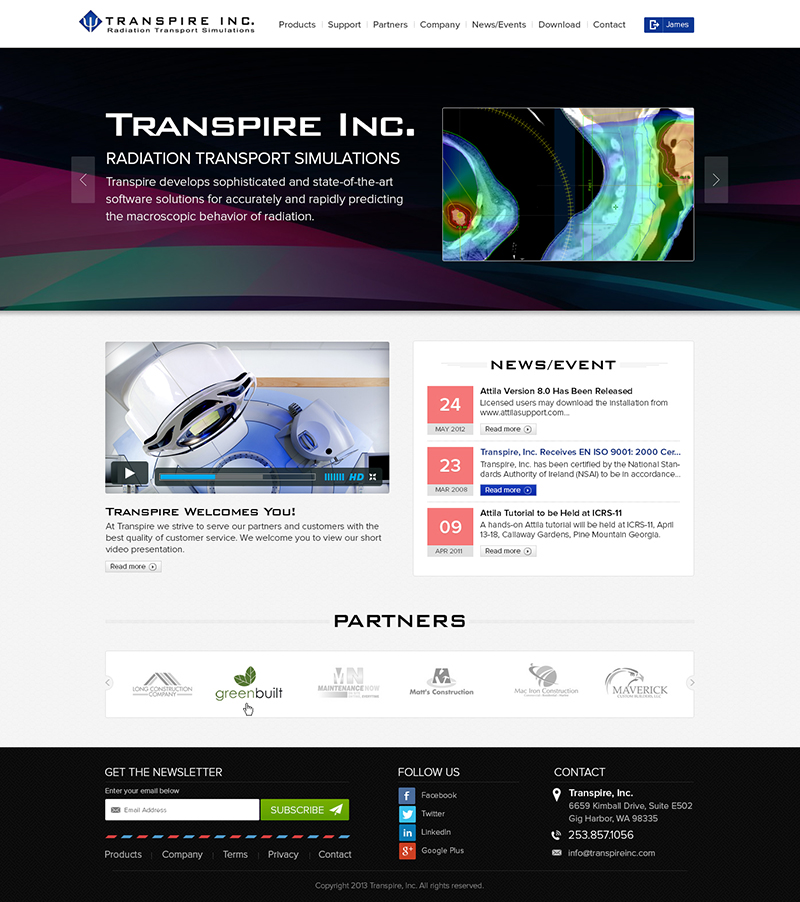
This customer received 81 web designs from 13 designers. They chose this web design from Designcraft as the winning design.
Join for free Find Design Jobs- Guaranteed
-
 US$780
-
 81 designs
-
 13 designers
Web Design Brief
- Introduction
This is a web site redesign content. Please follow the following instructions. I am on tight schedule, so instead of 10 days, I would like to select the final design within 7 days. After the final design is selected, I would like the winner to produce the static HTML pages, but that is a separate job.
Delivery is JPG, complete Layered PSD files, and color numbers used in the design.
- Language of Content of the Web Site: English
- Company Name: Transpire, Inc.
- What is Transpire, Inc.'s product? Company develops and markets a sophisticated engineering simulation software.
- URL of existing web site: http://www.transpireinc.com
- Purpose of the web site: Marketing Engineering and Simulation Software
- Markets/Industries served
1. Medical: Radiotheraphy, Cancer Therapy, Medical Imaging
2. Energy: Nuclear Physics
3. National Security: Dept. of Homeland Security
- Three most important messages to communicate to our audience:
1. A solid and sophisticated engineering company (sophisticated).
2. A company with cutting-edge technology and leading products (cutting edge)
3. A company with state-of-art, live and professional marketing (state-of-the-art and live)
- What differentiates Transpire, Inc. from other competitors?
1. We are a commercial company vs. a home-grown entity with competitor products.
2. Our software is in-depth and targeted application vs. a general software with certain capabilities.
- Desired homepage screen size: 1280x800 or use your best recommendation.
- Number of templates: 2
1. Homepage
2. Secondary pages
- What content must be included in the Homepage (video, slideshow, etc.)?
1. Header block to display the logo, company name, and login or registration space (if user is logged in, show username)
2. One primary block to display a slide presentation (in HTML5, up to 4 or 5 slides with combined image and text)
3. One block to display a video and ability to play the video with a link "More" to go to the Video Training page.
4. One block to display announcements and special events
5. One block to display up to three News/Events. A Caption and Date.
6. One block to showcase links to three social networks: Facebook, Linkedin, and Twitter.
7. One block for Footer. Standard links and copyright notice
- Describe secondary pages: They will include text and images (JPG or PNG). A Training page will display a list of (up to 5) video clips.
- Site Menu Structure
1. Top Level. Up to 6 main menu as follows: Products, Support, Partners, Company, News/Events, and Purchase.
2. Second Level. Each top-level menu could have up to 4 sub-menu options. Some like Partners will not have any page. You don't have to display Third-level menus here.
3. Third Level. Some second-level menu items could have from up to 4 sub-menu options. Third-level menu options should appear in the template for secondary pages.
For example, under main menu "Products" we have three products one of which is "Attila4MCNP." This product will have 4 options (4 pages). The template for the secondary pages should be flexible enough to allow for more than 4 but less than 6-7 options for each product.
(I will upload the Site Map document shortly)
- Style/theme of the Website:
1. Large enough font size. Audience is 30 and older.
2. Appealing to users of a highly-sophisticated desktop-based simulation software
- Desirable colors in the new design: Blue (because of logo), red, green, gray, black. White or Black background
- Adjectives that should best describe the new design: Welcoming, exciting, informative, and professional
- Websites you like (because?):
http://www.gurobi.com. Only because they also develop sophisticated software and they follow a similar licensing scheme, but PLEASE do not copy their UI.
Updates
To all Designers,
IMPORTANT DEADLINE: I am on tight schedule, so instead of 10 days, I would like to select the final design within 7 days.
Thank you in advance.
Added Saturday, September 28, 2013
To all Wonderful designers,
I just uploaded the web site map for this project. It is an spreadsheet document. Notice, the column labeled as "Left-column Menu on secondary pages" is really the menu option for Product pages, or what I refer to in the Brief as the third-level menu.
You need to come up with a creative design to handle the third-level menu option on Products pages. Your design should be flexible/expandable such that it allows for different number of menu options per product.
Also, notice product "Acuros" has one menu option, but products "Attila"
and "Attila4MCNP" have four menu options. Each product, however, will
have its own introductory page (the so-called index.html).
Finally, Do NIT display the third-level menu options for products as cascaded on the main menu drop-down design. I mean do not display three levels of menu. It becomes confusing. Handle the third-level menu on the secondary pages.
I understand that designers try first to get the Homepage designed, and then they design the template for secondary pages. I am OK with this approach, as long as in the back of your mind you know you should show the third-level menu.
Added Sunday, September 29, 2013
o all Designers,
I will announce the winner tomorrow (in about 12 hours from now). I selected three finalists from Design Crowd.
I would like to thank every one of you who submitted your designs. I
appreciate it very much. Although I will announce one designer, but
every design has its own place and merit. It is always the contest
holder''s taste that determines the winning design. So, the decision is
always subjective.
Good luck all with your efforts.
Regards
Added Tuesday, October 08, 2013
Target Market(s)
- Age: 30 years and older
- Mostly male.
- Job Title: Researchers, Doctors, and Engineers
- Users of radiotheraphy, cancer therapy, medical imaging, nuclear energy, and homeland security radiation simulation software
Industry/Entity Type
Marketing
Look and feel
Each slider illustrates characteristics of the customer's brand and the style your logo design should communicate.
Elegant
Bold
Playful
Serious
Traditional
Modern
Personable
Professional
Feminine
Masculine
Colorful
Conservative
Economical
Upmarket
Requirements
Must have
- - What content must be included in the Homepage (video, slideshow, etc.)?
1. Header block to display the logo, company name, and login or registration space (if user is logged in, show username)
2. One primary block to display a slide presentation (in HTML5, up to 4 or 5 slides with combined image and text)
3. One block to display a video and ability to play the video with a link "More" to go to the Video Training page.
4. One block to display announcements and special events
5. One block to display up to three News/Events. A Caption and Date.
6. One block to showcase links to three social networks: Facebook, Linkedin, and Twitter.
7. One block for Footer. Standard links and copyright notice.
Nice to have
- As you see I gave a thorough and detail design brief (I hope so). I leave it to you to incorporate "nice to haves" in your design.
Should not have
- - No Cartoonish Design or Animation
- Colors we do you NOT like: Purple, Pink, Yellow, Brown