Bespoke luxury feel wordpress website
Want to win a job like this?
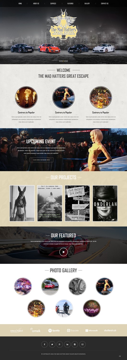
This customer received 22 web designs from 2 designers. They chose this web design from pb as the winning design.
Join for free Find Design Jobs-
 £245
£245
-
 22 designs
-
 2 designers
Web Design Brief
Looking for a premium template design that covers roughly 7 pages, seo / keyword factors are importand when designing the site with the point of sale being visual is an important factor. The website needs to look a luxury design in white, black and gold foil with a sleek visual but creative look. The site will need to have a blog area, along with a sign up option, and the following: About, who we are, the adventure, our sponsors, gallery, merchandise, events as well as all social media buttons connected and responsive as all websites should be these days. We are also lookig for email and service provider but have already bought the website name.
Target Market(s)
premium, luxury clients, business owners, super cars, luxury travel, events, motorsport
Industry/Entity Type
Events
Coding
Coded - Design and coding required
Number of Pages Required
5+ page
Font styles to use
Other font styles liked:
- calibri, calibri light, agency FB
Look and feel
Each slider illustrates characteristics of the customer's brand and the style your logo design should communicate.
Elegant
Bold
Playful
Serious
Traditional
Modern
Personable
Professional
Feminine
Masculine
Colorful
Conservative
Economical
Upmarket
Requirements
Must have
- a luxury up to date feel, with imagery. Must have the colours black white and gold. Pref gold on white. Blog and social media connections which is easy to use on the wordpress so I can self manage the site to update. Be responsive and lots of pictures visual. Members area login, FAQ section at bottom of the page with t&c's and a contact page obviously. Simple but super effective and visually beautiful. The gold should be a champagne gold not a deep gold, see images attached with PromoCoutire signature with the logos on please
Nice to have
- movement on the page so it look eye catching. Nice fonts, client log in area for members. Look eccentric and out of the box
Should not have
- look too busy and unmanageable