Re-design / improvement of an existing site
Want to win a job like this?
This customer received 17 web designs from 4 designers. They chose this web design from pb as the winning design.
Join for free Find Design Jobs- Guaranteed
-
 €250
€250
-
 17 designs
-
 4 designers
Web Design Brief
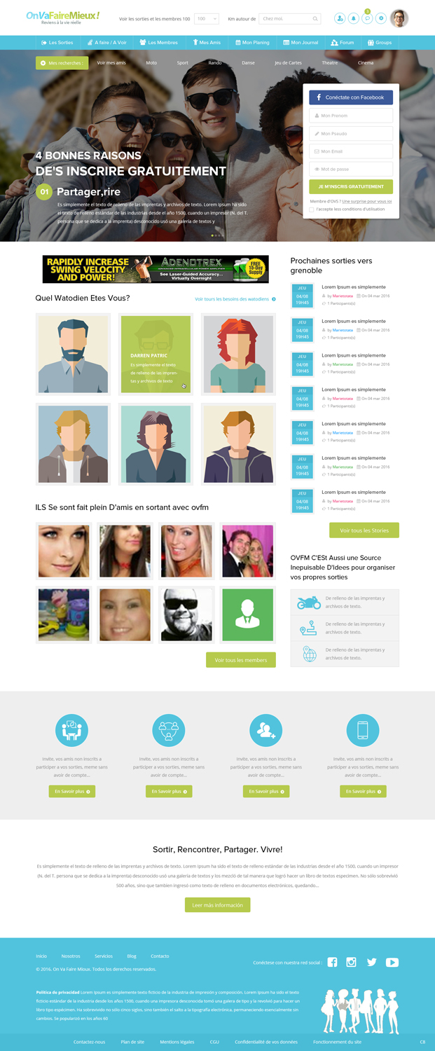
Re-design / improvement of an existing site This is to re-design a site (home 2 pages provided below ...). Only the home is to designer, the other pages are there for the brief only. The site is a social network sharing activities (sport, dance, cinema, outings ...) with friends, a bit like meetup, but more fun, less 'business'. It is necessary to remain in clear tones, the site must above all be playful and 'friendly', warm, light, easy to understand and navigate. This is not a site intended to 'sell', but a site on which users often connect (like Facebook, for example), many pages are consulted at each visit, the site should not be aggressive or heavy , boring. Only call to action should be clearly visible, easy to find. The design is existing, psd can be provided, but the graphical result is not satisfactory. It is therefore pure graphic work that is required. Ergonomics is not to question, but the designer can change the sizes and shapes of buttons, areas, menu, pictograms, etc ... Eventually, the organization of headings can be changed, if the designer wishes it. But not the body of the page. Just think that the site will be responsive if you modify arrangements (header) It is a work of general consistency, balance in colors and shapes, general readability of the page. It should not be 'clutter', it must be intuitive and readable for users not necessarily very used to surf the internet. There are no imposed colors, one must only be 'friendly', playful, so no colors very marked, stay in clear tones ... The focus is on the human, the human relations, the pleasure, friendliness. The final name to put in the header is 'Evenup', there is no definitive logo for the moment. Target: individuals, 50% men / women, aged 35 to 60, rather single. It is a work of general coherence, of balance in the colors and the forms. There are no imposed colors, one must only be 'friendly', playful, so no colors very marked, stay in clear tones ... There is a 'post it' effect in the header, it is not is not taxed.
Target Market(s)
BtoC, mixed men / women, aged 35 to 60, globally single.
Number of Pages Required
1 page
Font styles to use
Look and feel
Each slider illustrates characteristics of the customer's brand and the style your logo design should communicate.
Elegant
Bold
Playful
Serious
Traditional
Modern
Personable
Professional
Feminine
Masculine
Colorful
Conservative
Economical
Upmarket
Requirements
Must have
- Fund imperatively clear. The 'Gstar raw' area in the header is a pub banner, so leave it unchanged, or put another ad in the same format. The photos of people must be kept: They are deliberately of poor quality, because on the site, we have no control of these photos that are uploaded by members. You can however consider shading these photos, or any effect that is manageable in HTML / CSS. The principle of avatars must also be preserved, but you can use other avatars if you wish. Finally, words are in pink or blue (pseudo members). It must also be kept, it corresponds to the sex of the members (woman / man).
Nice to have
- It is a work of general coherence, of balance in the colors and the forms. There are no imposed colors, one must only be 'friendly', playful, so no colors very marked, stay in clear tones ... There is a 'post it' effect in the header, it is not is not taxed.
Should not have
- Attention, the target is 35, do not put a typo too small, it must be very legible.