Personal Trainer needs logo
Want to win a job like this?
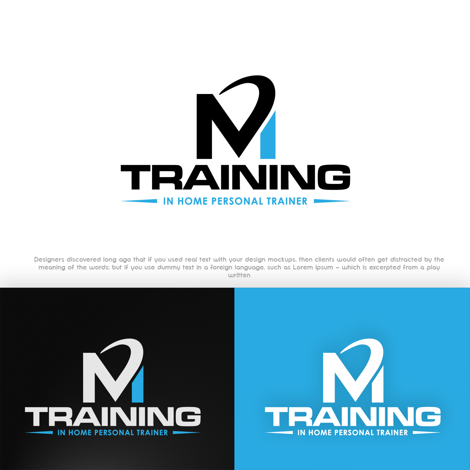
This customer received 228 logo designs from 66 designers. They chose this logo design from Akisaputra as the winning design.
Join for free Find Design Jobs- Guaranteed
-
 C$150
C$150
-
 228 designs
-
 66 designers
Logo Design Brief
I need a logo design for my new business called "M Personal Home Training". The "M" is the company name and "Personal Home Training" is the tag line. The "M" is the initial of my name, Mitch. It is a private at home personal training business, where I drive to clients homes to give them a full service of 1 on 1 personal training. My theme colours are black and light ocean blue.
Target Market(s)
Adults (18+), male and female. Individuals who want the luxury and convenience of having a personal trainer provide health and fitness services to them (such as 1 on 1 workouts and nutritional guidance) all at the comfort of their own homes. Individuals with time constraints and lack of confidence to sign up at a gym.
Industry/Entity Type
Business
Logo Text
M Personal Home Training
Logo styles of interest
Lettermark Logo
Acronym or letter based logo (text only)
Colors
Colors selected by the customer to be used in the logo design:
Look and feel
Each slider illustrates characteristics of the customer's brand and the style your logo design should communicate.
Elegant
Bold
Playful
Serious
Traditional
Modern
Personable
Professional
Feminine
Masculine
Colorful
Conservative
Economical
Upmarket
Requirements
Must have
- A premium business look. Uniqueness and a reflection of my individuality and my mission to provide premium 1 on 1 personal training to my clients. The personal training speciality that I provide leans more towards body composition training (burning fat, building lean muscle, and a strong body) as well promoting a healthy lifestyle for the body.
Nice to have
- An eye catching "M", something that is unique and stands out. The M should be the focus as it is the name of the business whereas "personal home training" is the description/tag line that should be somewhere in the logo so people know what the business is about. Through looking at other company logos, i find i am intrigued by a soft and round look as opposed to a boxy look.
Should not have
- A boxy look. I do not want any images or symbols such as workout equipment or health type items.