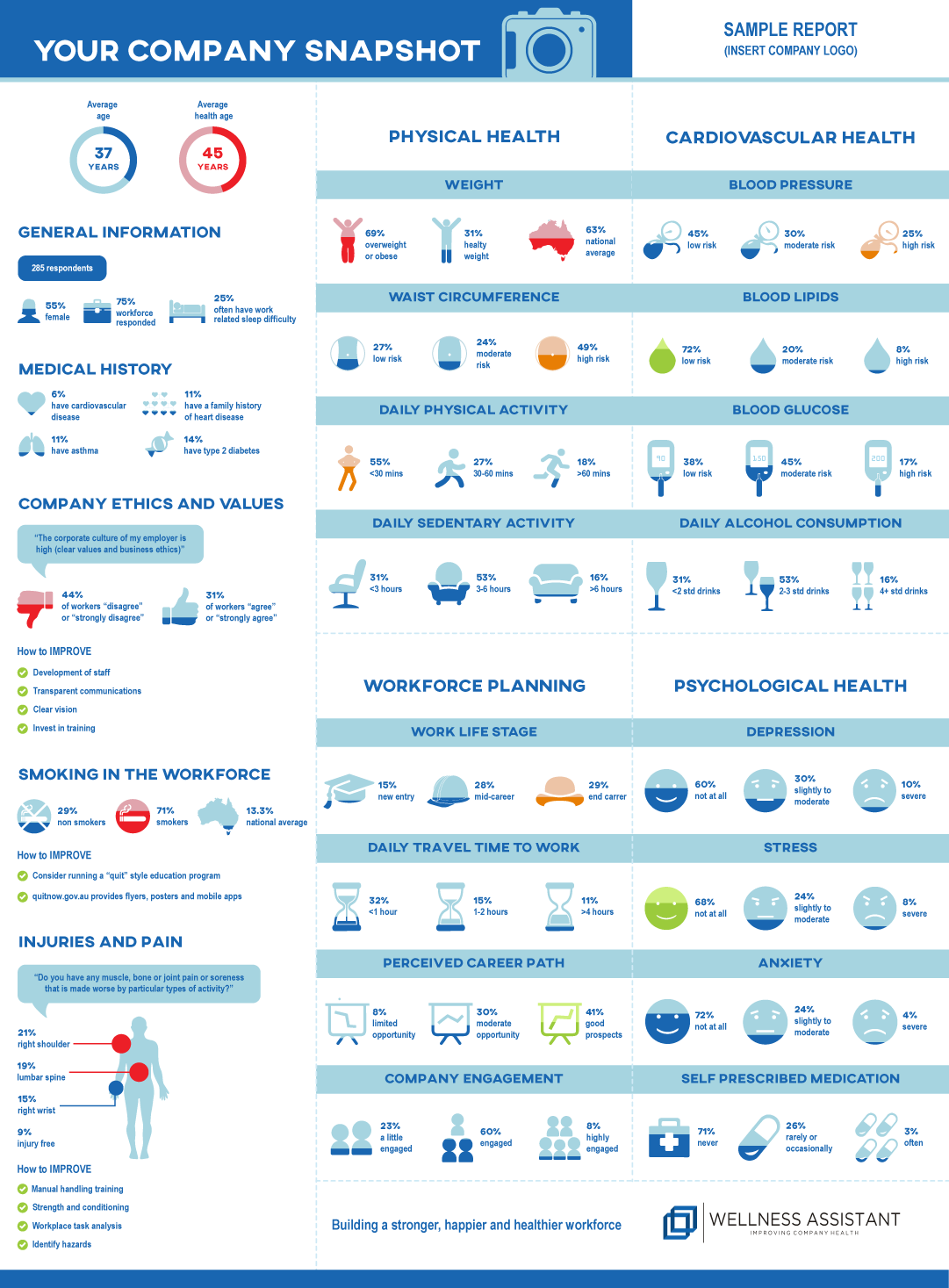
Infographic for an online health and wellness tool. Breakdown of data in an easy to read format
Want to win a job like this?
This customer received 14 infographic designs from 8 designers. They chose this infographic design from patestevao as the winning design.
Join for free Find Design Jobs- Guaranteed
-
 A$300
A$300
-
 14 designs
-
 8 designers
Infographic Design Brief
The design we require is an infographic poster. We have an online tool that is used to audit companies on how healthy their employees are and how their employees feel regarding their employment. Simply put the online tool we have designed is used to health screen employees and ask specific questions regarding their current employment. The results are summarised and this data is used by the company to assist with workplace health and workforce planning. The data is collected and presented back to the company so they can target specific areas that are relevant to their company. This will enable the company to spend any available funds to areas that require improvement in the workforce. I have provided a sample infographic I have designed below, please don't laugh :) as an example of the data we collect. As this will only be a sample please feel free to change the data if you need or remove / simplify data if you think it would better. I would also like it if you highlighted three main areas that require action and some areas that do not require action and the company is doing well in. I have also attached an infographic design that I like
Target Market(s)
Corporate
Industry/Entity Type
Health And Wellness
Colors
Colors selected by the customer to be used in the logo design:
Look and feel
Each slider illustrates characteristics of the customer's brand and the style your logo design should communicate.
Elegant
Bold
Playful
Serious
Traditional
Modern
Personable
Professional
Feminine
Masculine
Colorful
Conservative
Economical
Upmarket
Requirements
Must have
- Target areas that the company needs to address as a first priority. For example high number of lower back injuries, poor business culture, high obesity / sedentary rate
Nice to have
- Three categories that define the most important areas that require attention, second priority and things the company is doing extremely well in
- White background, clear and simple heading, modern icons, creativity
Should not have
- photos, not too many colours