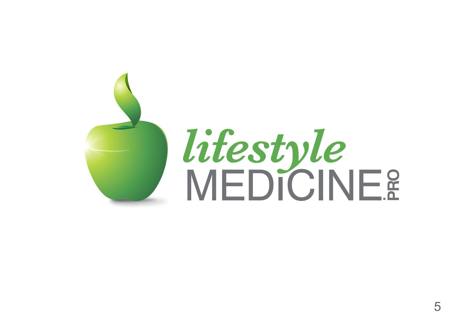
Lifestyle Medicine Pro logo for medical practice support service and network
Want to win a job like this?
This customer received 240 logo designs from 61 designers. They chose this logo design from geepee21 as the winning design.
Join for free Find Design Jobs- Guaranteed
-
 US$310
-
 240 designs
-
 61 designers
Logo Design Brief
Already 90% designed: concept, outline, colors, etc. Need to "bring to life" and make graphics.
Green apple. Dark green leaf - curved so vaguely looks like outline of thumb in a "like" "thumbs up" outline. Possibly on blue blue background vs white.
Possible shine effect on left edge that has a shine line going halfway across vaguely giving impression of finger lines.
See attached outline. Don't want symmetrical apple. Want to follow apple outline fairly closely. Leaf position negotiable a bit. Want line down leaf to give dimension like on real leaf.
Logo text can be on different lines.
Updates
Project Deadline Extended Reason: Adding more direction to brief. Added Friday, September 30, 2016
Target Market(s)
Medical professionals, physicians, healthcare systems.
Industry/Entity Type
Health Care
Logo Text
LifestyleMedicine.Pro
Logo styles of interest
Pictorial/Combination Logo
A real-world object (optional text)
Font styles to use
Colors
Colors selected by the customer to be used in the logo design:
Look and feel
Each slider illustrates characteristics of the customer's brand and the style your logo design should communicate.
Elegant
Bold
Playful
Serious
Traditional
Modern
Personable
Professional
Feminine
Masculine
Colorful
Conservative
Economical
Upmarket
Requirements
Must have
- NEW DIRECTION: See attached LifestyleMedicine.com image -- need this level of quality. Company website up now -- see: lifestylemedicine.pro for general feel and color. Need outline and feel of "thumbs up 'like' hand" without being obvious. Simplicity of logo of lifestylemedicine.com or lifestylemedicine.org (simple, effects with simple gradients). Shine lines are not looking natural. Maybe just one shine spot/line would work. Open to variations. Thanks!
- Clean professional look. Compare with logo of ACLM at lifestylemedicine.org.
- See attached image file of 14 green apples -- closest to what looking for is the last one #14. First image with white lines is experiment -- this one is overdone, but would like one or more "shine" spots on edge with glare line coming part way across IF it can look fairly natural (otherwise better without). But, generally looking for style like logo at lifestylemedicine.org -- flat, gradients, nuanced impressions of other things (in this case very subtle "thumbs up" outline while still looking totally "apple"). See attached image file of sketch with secondary lines (like where middle leaf line would go).
Nice to have
- As above in description