NEW NEUE UPDATE The Hills Weekly Logo - HELVETICA NEUE ** FINAL UPDATE** NEW INFO
Want to win a job like this?
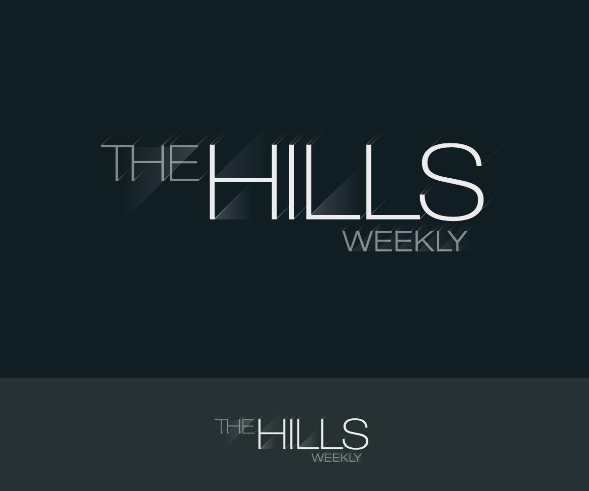
This customer received 317 logo designs from 44 designers. They chose this logo design from Formen as the winning design.
Join for free Find Design Jobs- Guaranteed
-
 US$160
-
 317 designs
-
 44 designers
Logo Design Brief
*** FINAL UPDATE ***
In the reference images area, is an example we like a lot titled:
An example we love.jpeg File 5
Please take a look at and if you have an interpretation of it or are inspired by it PLEASE SEND US YOUR DESIGN.
We want the logo to use black, white and grey type, USING HELVETICA NEUE THIN OR HELVETICA NEUE LIGHT.
If you have a new direction that user this as your jumping off point now is the time to show us.
We are looking for a beautiful, simple and clean logo design for a new podcast called "The Hills Weekly"
We would like your design to be influenced by the Hills logo in the Hills Season 1 example below. Please look at the references when you have a moment.
We are NOT looking to include any images that suggest hills or microphones (since it's a podcast) The podcast is an episode by episode discussion about the MTV series The Hills which aired from 2006 to 2010.
Looking forward to seeing your work! Thank you!
Target Market(s)
Fans of the TV show The Hills
Industry/Entity Type
Entertainment
Logo Text
The Hills Weekly
Logo styles of interest
Wordmark Logo
Word or name based logo (text only)
Font styles to use
Look and feel
Each slider illustrates characteristics of the customer's brand and the style your logo design should communicate.
Elegant
Bold
Playful
Serious
Traditional
Modern
Personable
Professional
Feminine
Masculine
Colorful
Conservative
Economical
Upmarket
Requirements
Must have
- The title: The Hills Weekly
- Please use Helvetica Neue THIN or Helvetica Neue LIGHT.
- Would like the "Weekly" to be in a smaller type size.
- We love the colors Black, White & Grey
- ALL TYPE.
Should not have
- No icons or other graphics or imagery please.
- No hills or hollywood sign icons or icons of any kind.