Web 2.0 my 1 page website ($500 Guaranteed)
Want to win a job like this?
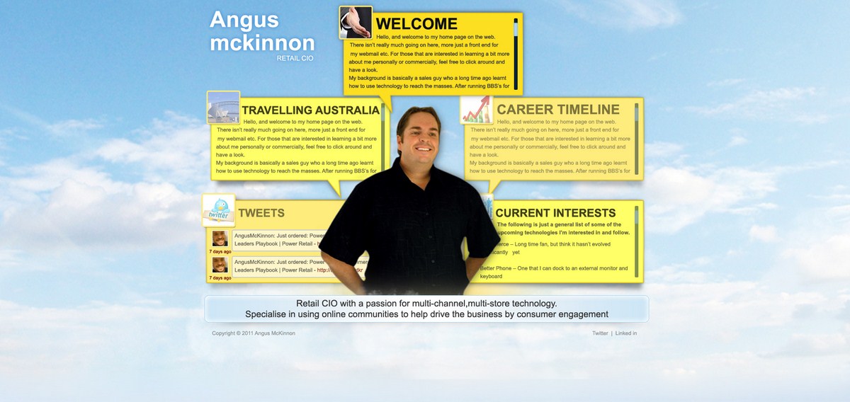
This customer received 16 Wordpress designs from 6 designers. They chose this Wordpress design from pb as the winning design.
Join for free Find Design Jobs- Guaranteed
-
 A$500
A$500
-
 16 designs
-
 6 designers
Wordpress Design Brief
Im looking for someone who can update my existing design at http://www.angusmckinnon.com
I like existing layout and the way the boxes all work. Looking for the same design but with an updated web 2.0 textured look and feel.
Please note the current site is already working on top of wordpress and new design needs to also work with wordpress so I can continue to page content.
Looking for designer who can also get it working in wordpress as it is today.
$500 AUD first prize for it all working.
If it helps:
I like minimailist. I like white. I like bright. I like texture. I like backgrounds. I like horizontal stripes running the length of the page. I like designs that work regardless of width of page. I like big bold statements. I like obvious. I like round edges. I like sites that look like they have come alive. I like depth. I like a 3D look. I like something very subtle that moves occassionally - just enough to catch your eye. I dont like popups. I dont like scrolling.
I like really clean SEO friendly source code. I like standards compatible design.
http://www.prizeclub.ie/ I like the depth of the mini coming out of the screen. I like the big bold fonts and the bright colours. I like the horizontal red stripe running the length of the page.
http://www.7thsense.ie/ I like the backround clouds. I like the nice big lettering on the font on the mene bar. I like the nice bog boxes and contact numbers.
http://www.vertaaverkkoja.fi/ I like the bright colours on the phone. I like the splash of the bubbles at the top of the page.
http://beforeidie.me/ I like the blurred background. I REALLY like the rounded enter your email and notify me text boxes. I like the fonts on notify me and the textured background of the button.
http://2mlab.com/it/ I really like the horizontal bar across the page - I like the big fonts in this background - I like the green and the orange. I really like the depth - how the beans and chair and butterfly sit on top of the page kind of bringing it to life. Like all the layers giving that illusion of 3D.
http://www.alanpower.net/ Like the big fonts, the horizontal bar, the leather stitching look around the "lets work together" and how everything is shadowed and sits off the page. I like the big contact us / get in touch / fonts at the bottom the big social media buttons. Probably this area could all be half the size but I like it.
http://www.stylapps.com/ I like the graining textures in the background grays. I prefer blues and whites.
http://kamloopsstorage.ca/ Like the big bold texts and the colours. Like the 3D cardboard box coming off the page.
http://weathernotifier.com/ Like the textured backround - the rough grainy blue.
http://www.ba-sm.com/ I always liked those background kind of bursts behind the bay area picture in the middle. Like the striped blue background.
http://workshop.rillusion.com/ Who doesnt like a ninja, but again like the big fonts and the way the person has depth
http://www.creativemints.com/ I like the depth. I like the big bold colours.
http://www.2udoku.com/ Again like how the product is featured with lighting behind it, has that 3D look. Nice big lettering etc.
Updates
I like minimailist. I like white. I like bright. I like texture. I like
backgrounds. I like horizontal stripes running the length of the page. I
like designs that work regardless of width of page. I like big bold
statements. I like obvious. I like round edges. I like sites that look
like they have come alive. I like depth. I like a 3D look. I like
something very subtle that moves occassionally - just enough to catch
your eye. I dont like popups. I dont like scrolling.
I like really clean SEO friendly source code. I like standards compatible design.
http://www.prizeclub.ie/
I like the depth of the mini coming out of the screen. I like the big
bold fonts and the bright colours. I like the horizontal red stripe
running the length of the page.
http://www.7thsense.ie/
I like the backround clouds. I like the nice big lettering on the font
on the mene bar. I like the nice bog boxes and contact numbers.
http://www.vertaaverkkoja.fi/ I like the bright colours on the phone. I like the splash of the bubbles at the top of the page.
http://beforeidie.me/
I like the blurred background. I REALLY like the rounded enter your
email and notify me text boxes. I like the fonts on notify me and the
textured background of the button.
http://2mlab.com/it/
I really like the horizontal bar across the page - I like the big fonts
in this background - I like the green and the orange. I really like the
depth - how the beans and chair and butterfly sit on top of the page
kind of bringing it to life. Like all the layers giving that illusion of
3D.
http://www.alanpower.net/
Like the big fonts, the horizontal bar, the leather stitching look
around the "lets work together" and how everything is shadowed and sits
off the page. I like the big contact us / get in touch / fonts at the
bottom the big social media buttons. Probably this area could all be
half the size but I like it.
http://www.stylapps.com/ I like the graining textures in the background grays. I prefer blues and whites.
http://kamloopsstorage.ca/ Like the big bold texts and the colours. Like the 3D cardboard box coming off the page.
http://weathernotifier.com/ Like the textured backround - the rough grainy blue.
http://www.ba-sm.com/ I always liked those background kind of bursts behind the bay area picture in the middle. Like the striped blue background.
http://workshop.rillusion.com/ Who doesnt like a ninja, but again like the big fonts and the way the person has depth
http://www.creativemints.com/ I like the depth. I like the big bold colours.
http://www.2udoku.com/ Again like how the product is featured with lighting behind it, has that 3D look. Nice big lettering etc.
Typical Components of Web 2.0 Site Design
- Lots of space: Web 2.0 sites tend to have a lot of wide-open space. It's a contrast from the 90s, where the trend was to make usage of every square inch of a website's home page with links, banners and applets. White space is embraced to a major degree, as it calls attention to important buttons and links.
- The "Less Is More" Mentality: By putting less on the page, you're drawing more attention to the elements that matter: content and call-to-action buttons. "Clutter" and Web 2.0 simply do not mix - this is a new era of design psychology.
- Gradients: Merely a design element, gradients are used in Web 2.0 site design to give a clean, soft impression that's easy on the eyes.
- Large Fonts: Huge headings are a popular trend in Web 2.0 design - headings are usually taglines that describe or summarize what a website is about in just a handful of words. It's a huge benefit to first-timer usability, especially since new visitors would like to "get to the point" without having to read an intro paragraph.
- Dramatic Color Contrast: Another typical element seen in Web 2.0 design are bright colors (particularly neon colors) that accent site elements including menus, separator bars and footers. Many sites use this same neon color for their hyperlinks and headings, as well. Sometimes, the contrast between bright neon colors and charcoal or light gray text are put in unison for a dramatic effect.
- Eye Candy Logos: In Web 2.0 logo design, it's almost expected to see logos have a shiny plastic luster, or a soft gradient. Most Web 2.0 fonts are similar to basic Arial, Tahoma or Helvetica, and are simple. The colors used within the logo are also typically mimicked on other site design pieces to create a sense of uniformity.
- Huge Buttons: Calls to action (buttons that prompt you to "Get More Information," "Download Now," "See A Demo" or "Buy Now") are typically gigantic in Web 2.0 design. They're also attractive, featuring a color that strays away from the rest of the website's schematic. These buttons are typically isolated by a great deal of space, making them very easy to notice.
- Reflections: Product images, screenshots and icons can be seen as having "reflections" underneath them, as if they were standing on top of a new laminate floor. It's a stereotypical design element of Web 2.0.
- Lots of Icons: Web 2.0 icons are always in vector format, which is the standard format created by software such as Adobe Illustrator and Flash. They're attractive and clean looking, and are used to either draw attention to a website's sub-categories, a product's individual features, or anything else that the web designer wanted to help associate for a viewer.
- Exaggerated Web Form Fields: Huge form fields add to usability and draw attention to sign-ups and registrations. Instead of typing in a search, a username or anything else into a tiny web field, Web 2.0 has evolved them into massive interactive boxes with large text that makes things easy to see. For a good example, look at Tumblr.com's huge fields.
Added Friday, November 25, 2011
Project Deadline Extended
Reason: Havent found a design I would change my site to yet.
Added Sunday, December 04, 2011
Industry/Entity Type
Media
Look and feel
Each slider illustrates characteristics of the customer's brand and the style your logo design should communicate.