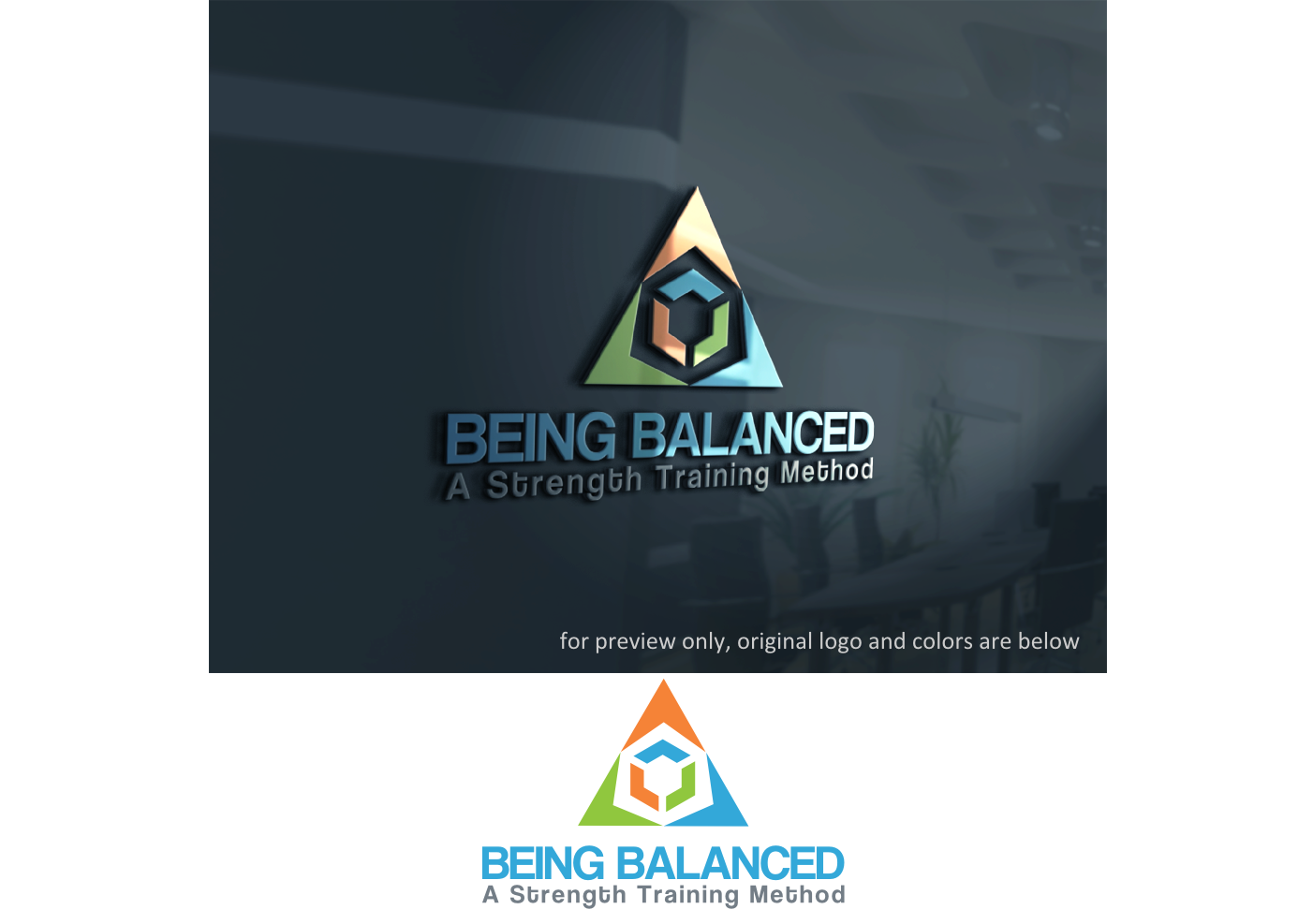
Being Balanced- A Strength Training Method
Winner
Want to win a job like this?
This customer received 5 logo designs from 3 designers. They chose this logo design from Gita. as the winning design.
Join for free Find Design Jobs- Guaranteed
-
 US$150
-
 5 designs
-
 3 designers
Logo Design Brief
Rethink the method of building a strong body into balance, often recommending multiple sets of reps of a unilateral exercise on the weaker side to bring one’s body into balance. We envision our business marketing using something along the lines of "Being Balanced – A Strength Training Method." It is also a book title with a subtitle of: The Ten Steps to Building a Balanced Body.
Target Market(s)
Fitness, wellness, strength training
Industry/Entity Type
Training
Logo Text
Being Balanced -A Strength Training Method.
Logo styles of interest
Character Logo
Logo with illustration or character
Font styles to use
Other font styles liked:
- Bold
Colors
Colors selected by the customer to be used in the logo design:
0355a3
a5ce39
ffcf3e
Look and feel
Each slider illustrates characteristics of the customer's brand and the style your logo design should communicate.
Elegant
Bold
Playful
Serious
Traditional
Modern
Personable
Professional
Feminine
Masculine
Colorful
Conservative
Economical
Upmarket
Requirements
Must have
- A body in the power pose, Wonder Woman position
- show balance and strength. A fit toned body
Nice to have
- Female and male power position posed athletes
Payments
1st place
US$120
Participation payments x 2
US$15