Logo for nettavle - digital white boards
Want to win a job like this?
This customer received 69 logo designs from 35 designers. They chose this logo design from Alex C. as the winning design.
Join for free Find Design Jobs-
 €120
€120
-
 69 designs
-
 35 designers
Logo Design Brief
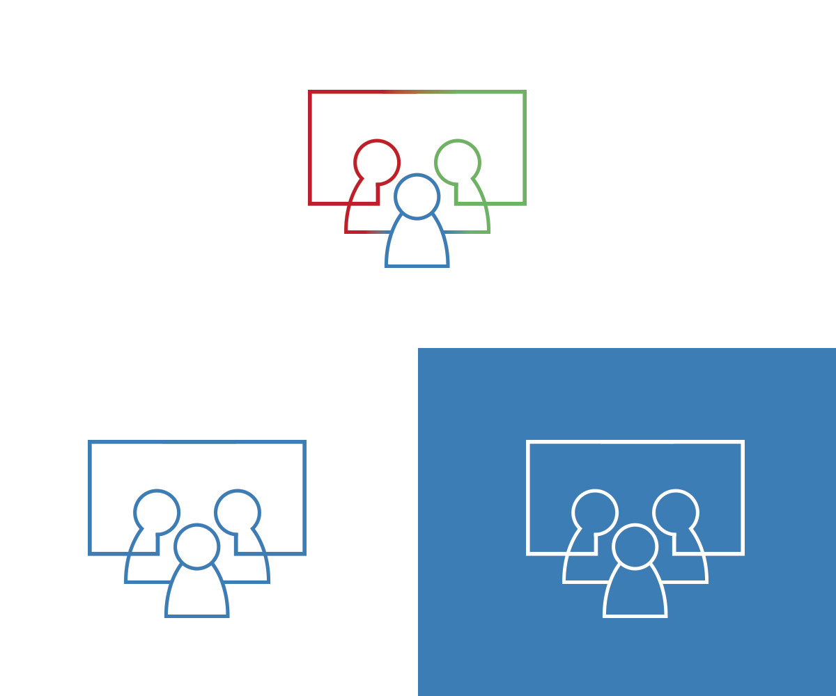
Right now we have created an ugly logo in powerpoint - see it at www.nettavle.dk (also attached)
What the current logo tries to express is the fact that we produce digital white boards used for team meetings. So in the current logo, the square means the digital whiteboard and the four circles are 4 people gathered around the digital whiteboard. It is a similar story that we want to express, but it should - naturally - look much better. We sell this to companies so it must have a professional look. For the right candidate, there is much more work to be done for the web site as we right now only have the one page www.nettavle.dk.
Target Market(s)
Companies using lean for operations and/or projects. Often government units, municipalities, but could also be manufacturing companies.
Industry/Entity Type
Digital
Logo Text
no text right now
Logo styles of interest
Pictorial/Combination Logo
A real-world object (optional text)
Abstract Logo
Conceptual / symbolic (optional text)
Look and feel
Each slider illustrates characteristics of the customer's brand and the style your logo design should communicate.
Elegant
Bold
Playful
Serious
Traditional
Modern
Personable
Professional
Feminine
Masculine
Colorful
Conservative
Economical
Upmarket
Requirements
Should not have
- text