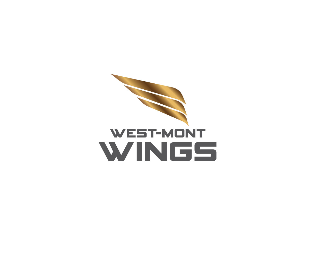
Sports Logo for West-Mont Christian Academy Wings

Want to win a job like this?
This customer received 71 logo designs from 24 designers. They chose this logo design from graphinedesign as the winning design.
Join for free Find Design JobsLogo Design Brief
We're looking for a Sports logo that might go on shirts, hoodies, baseball caps, etc. as well as various uniforms. We will also use the logo to go on scoreboards and field house wall. West-Mont Christian Academy is known as the West-Mont Wings (Wings is the mascot ... See our website www.west-mont.org ) West-Mont is a K-12 Christian School, with most of its sports at the middle and high school level. In the past we have used images of eagles or hawks, as well as some combinations of the letters "WCA" in various shapes... but we are now looking to promote a fresh new image in Athletics, which begins with the logo.
Target Market(s)
General population, but must be attractive to teenagers... primarily high school students. Somewhat conservative school but serving mostly Millennials.
Industry/Entity Type
Education
Logo Text
Possibly "Wings" or "West-Mont Wings" but not text is necessarily required
Logo styles of interest
Emblem Logo
Logo enclosed in a shape
Abstract Logo
Conceptual / symbolic (optional text)
Look and feel
Each slider illustrates characteristics of the customer's brand and the style your logo design should communicate.
Elegant
Bold
Playful
Serious
Traditional
Modern
Personable
Professional
Feminine
Masculine
Colorful
Conservative
Economical
Upmarket
Requirements
Must have
- Simplicity so that it will fit on a baseball cap (embroidered or screen printed) and quickly identifiable by its shape (words are not important). School colors are Black and Gold... but design shouldn't use heavy gradients since the screen printers and embroidery folks struggle with printing those shadings. Then we have to pay them to re-do the logo for set-up.
Nice to have
- We need it to be much simpler than our present logo, with an emphasis on Athletics... with a Wing(s) theme.
Should not have
- We don't want a logo to look like the our athletes have "earned their wings" on an airline.