Design my site www.headlinesdigest.com
Want to win a job like this?
This customer received 58 web designs from 4 designers. They chose this web design from pb as the winning design.
Join for free Find Design Jobs-
 US$410
-
 58 designs
-
 4 designers
Web Design Brief
So here is what I am thinking in terms of design:
https://doist.com
https://www.virginamerica.com
http://time.com/world-trade-center/
I want the theme to be white and blue (royal blue). I attached a paint picture of what I would like the site to look like in terms of placing the text. Generally, what I like about the sites above is that they are simple, you can navigate easily and have some kind of idea of what's going on by looking at the center (picture and motto). Let's establish a clear understanding of how the functional part of the site would look like. Please see the picture attached.
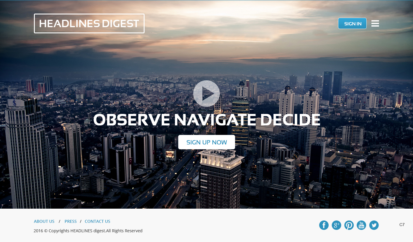
I want to keep it simple: On top would be the Name 'HEADLINES digest", somewhere to the right on top on the page would be 'Sign in" button.
In the center would be a picture (maybe a video) with the Motto (on top of it all in capital) OBSERVE NAVIGATE DECIDE and below would be the "sign up now"
Below the picture (like on time.com site) or to the left on top of the page would be "About Us', "Press" "Contact Us' buttons.
Then once the user gets to his page his got 3 tabs " Press Headlines", "Events", " Briefings".
we would keep the same format I only have on the site, but separate for every Tab.
I do not want the user to get distracted. I also want him to be able to access the page though mobile phone and be able to get automatic updates just like Google Alerts without having to sign in daily.
The landing page must be minimalist yet with business/corporate feel where users can navigate easily and a "what you see is what you get" approach. You want an image or video (personally I prefer the video.. it does capture the users attention instantly, as long as it is an interesting video), with your taglines in it.
Sections available to public: About Us, Contact Us, Landing Page with Signup Option
Private: Public Sections + User Account Page, Tabs for (Events, Press Headlines, Briefings)
Target Market(s)
PR/media monitoring/diplomatic community
Coding
Coded - Design and coding required
Number of Pages Required
1 page
Font styles to use
Colors
Colors selected by the customer to be used in the logo design:
Look and feel
Each slider illustrates characteristics of the customer's brand and the style your logo design should communicate.
Elegant
Bold
Playful
Serious
Traditional
Modern
Personable
Professional
Feminine
Masculine
Colorful
Conservative
Economical
Upmarket
Requirements
Must have
- a simple landing page, that is user friendly.
Nice to have
- a video with the explanation of how to navigate the site
Should not have
- too many colors, graphs etc.