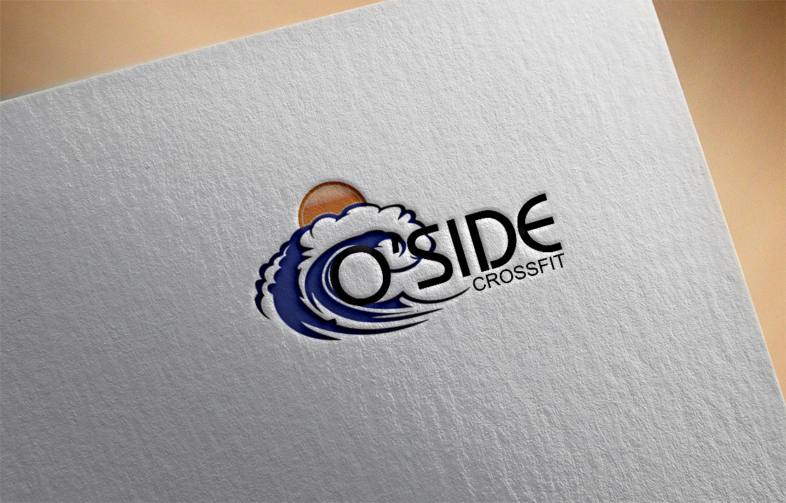
Oceanside CrossFit Company Logo
Want to win a job like this?
This customer received 83 logo designs from 32 designers. They chose this logo design from ES as the winning design.
Join for free Find Design Jobs-
 US$310
-
 83 designs
-
 32 designers
Logo Design Brief
We are looking for a logo that represents the Ocean and our CrossFit Gym. Our brand is O'Side CrossFit. We are looking for a Curling Wave that also looks like an "O" and can be used to stand alone symbol as representation of our business. Would like the wave to be smooth (representing beauty)at the back and through the crest with breaking whitewash which demonstrates the power of the wave. Connecting to the wave/O is 'Side (for O'Side) and underneath the water would be CrossFit. We have been playing around with this and have not been successful of tying the O to Side it just looks like a wave. Unless we differentiate the "O" within the wave it just looks like 'Side. Our company colors are Blue, White, and Black. We would like the wave blue, the whitewash white, and the font black. We are looking for a beachy down to earth fun font but demonstrates strength and stability. We would also like a sun in the upper right hand corner. We would also like the wave to apply the wave dimensions to the Golden Ratio of 1.618 and adjust everything else around it. I have uploaded kind of a sample of what we are trying to do but we are failing miserably. Thank You
Industry/Entity Type
It Company
Logo Text
O'Side CrossFit
Look and feel
Each slider illustrates characteristics of the customer's brand and the style your logo design should communicate.