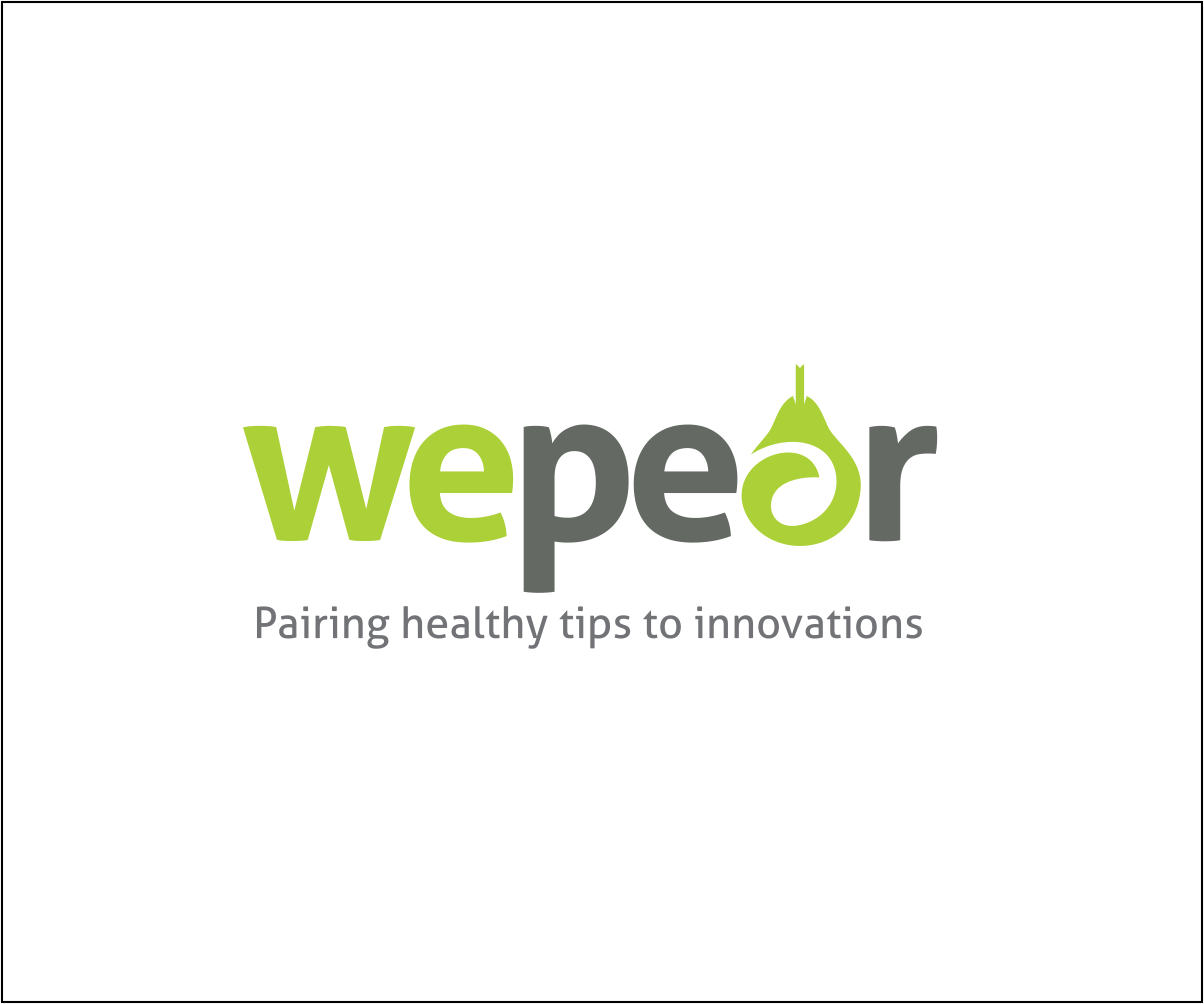
Rebrand "careXtend" to become "wepear"
Want to win a job like this?
This customer received 99 logo designs from 23 designers. They chose this logo design from Shreyas Arts as the winning design.
Join for free Find Design Jobs-
 US$160
-
 99 designs
-
 23 designers
Logo Design Brief
We recently relaunched our site careXtend (see http://www.carextend.com) and have decided to rebrand the site. The new new name will be "wepear".
The site is focused on making healthy living easy by pairing healthy tips with the latest product and service innovations. We chose the name "wepear" to play on the word "pear", being a healthy fruit. In addition pears are harvested by hand picking each one, just like we carefully curate, identify and hand pick each individual product or service innovation to be on our platform.
In addition, we like the play on the word pear and pair, whereby we provide helpful tips in the areas of fitness, weight loss, nutrition and beauty and we pair these tips with the latest product and service innovations in these areas, sourcing these innovations from places like indigogo, kickstarter, health blogs, etc., before they become readily available on sites like Amazon, Groupon, or other mass market channels.
We want the pear to be green and we'll be evolving the color palette on the site to match the new logo.
Target Market(s)
Women 25 - 55 with income > 40k
Industry/Entity Type
Health And Wellness
Logo Text
wepear; also want with and without tagline "pairing healthy tips to innovations"
Logo styles of interest
Pictorial/Combination Logo
A real-world object (optional text)
Font styles to use
Colors
Colors selected by the customer to be used in the logo design:
Look and feel
Each slider illustrates characteristics of the customer's brand and the style your logo design should communicate.
Elegant
Bold
Playful
Serious
Traditional
Modern
Personable
Professional
Feminine
Masculine
Colorful
Conservative
Economical
Upmarket
Requirements
Must have
- Picture of a green pear with a few different treatments. PLEASE NOTE, the attached example is only ONE conceptual idea. I don't want a bunch of examples that resemble this exactly.
- 1) pear in front of the word "wepear"
- 2) pear on top of the word "wepear"
- 3) version with a pear in the word in place of the "a" in pear
- 4) with and without the tagline "pairing healthy tips to innovations"
Nice to have
- Mix of options including serif and sans serif fonts
Should not have
- Nothing corny such as images of people holding hands or a face and hands on the pear.