Prestige SKINCARE company needs a logo!
Want to win a job like this?
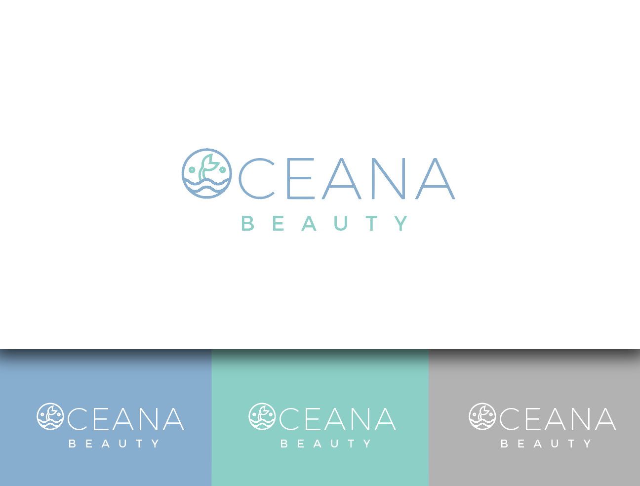
This customer received 43 logo designs from 18 designers. They chose this logo design from wonderland as the winning design.
Join for free Find Design Jobs-
 US$160
-
 43 designs
-
 18 designers
Logo Design Brief
I need a logo for a premium skincare company that will be sold in Sephora targeting the millennial and genXer consumer. Oceana Beauty will contain active marine derived ingredients that help prevent aging. The cleansers and moisturizers range between $40-$85 a piece. I'm interested in a simple, modern design using shades of blue/grey/green. I've also considered the possibility of using a small vintage sketch of a mermaid within the "O" of Oceana. The tag line for this brand will be "Skincare powered by the vitality of the sea." I rendered my initial thought and uploaded below - you don't have to use it as a jump off point, it's simply where my mind went first. I appreciate the simplicity of a brand like Eve Lom. I would be interested in both how to polish the version I uploaded and/or your creative ideas on how to better communicate my brand! Thanks for your ideas on this!
Target Market(s)
This brand will be marketed to 25-50 year old women with a strong digital and social presence. The uploaded model pictures are representative of what the brand faces will look like.
Industry/Entity Type
Cosmetics
Logo Text
Oceana beauty
Logo styles of interest
Pictorial/Combination Logo
A real-world object (optional text)
Wordmark Logo
Word or name based logo (text only)
Font styles to use
Colors
Colors selected by the customer to be used in the logo design:
Look and feel
Each slider illustrates characteristics of the customer's brand and the style your logo design should communicate.
Elegant
Bold
Playful
Serious
Traditional
Modern
Personable
Professional
Feminine
Masculine
Colorful
Conservative
Economical
Upmarket
Requirements
Must have
- This project must have a logo that lays out both a vertically and horizontally. The packaging will likely be blue/grey/green which means the logo will be white on the packaging but in color when on web or paper.
Nice to have
- I like the juxtaposition of new and old and thought it might be interesting to try a vintage mermaid or seahorse (or even scrimshaw?) within the "O" of Oceana. This would also lend itself to a lifestyle as the brand grows - it gives me room to play with new products, etc.
Should not have
- The essence of the brand is ocean, sea, wind, seaweed, etc. It shouldn't feel clinical or chemical at all. You shouldn't use script fonts either, simple and clean (though not average or common) fonts are best.