Marketplace Web Re-design overhaul @lightsapp
Want to win a job like this?
This customer received 51 web designs from 6 designers. They chose this web design from pb as the winning design.
Join for free Find Design Jobs- Guaranteed
-
 A$250
A$250
-
 51 designs
-
 6 designers
Web Design Brief
Hi,
We are currently in production with a website that is getting some mixed feedback about visual appeal and usability. We are using a responsive design and need to stay true to the logo colours and other marketing collateral we have in place. I will provide a brochure with the colour palate we use for some guidance. If you can please help us design something fresh and modern to communicate the essence of our company. The brochure will be a good summary of what we do and who we are targeting as customers. Our current website can be found at www.lightsapp.com. If there is any questions, please let me know.
Target Market(s)
Contractors and Corporate Companies
Industry/Entity Type
Information Technology
Number of Pages Required
4 page
Look and feel
Each slider illustrates characteristics of the customer's brand and the style your logo design should communicate.
Elegant
Bold
Playful
Serious
Traditional
Modern
Personable
Professional
Feminine
Masculine
Colorful
Conservative
Economical
Upmarket
Requirements
Must have
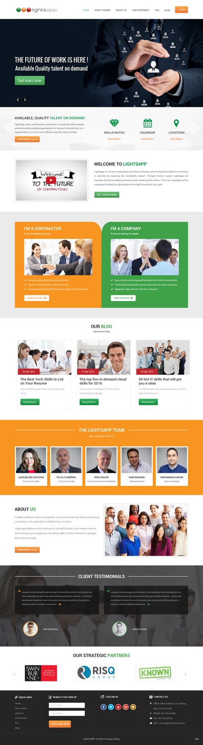
- Must have a complete new visual look, including
- 1. Images
- 2. Background colour scheme overhaul (not black)
- 3. re-design of the layout but keep to similar page breakdowns
Nice to have
- Some of the pages are a bit wordy, happy to have suggestions on how to reduce.
- Would be great if we can integrate the Scoop.IT! blog page to the Lightsapp page?
- This is some feedback a fellow UX designer provided to improve our CRO
- First off when you land on the home page, who is your audience? Are you everything to everyone? Even after watching the video (https://www.youtube.com/watch?v=m-UkcI2IDj4), I do not know what markets you service or who this app will be for.
- Your main headline and paragraph above the fold I find unnecessarily wordy and an overuse of 'buzzwords' . Perhaps you could look at appealing to the lowest common denominator and make it very simple and put it all into a simple sentence.
- The main hero image to the right of the headline offers no emotional pull at all. I'm assuming it's just a screenshot of your dashboard? Personally, I would be looking at using a person's image in that space.
- Also in this space, increase the size of your 'register' button. On the topic of your register button, you have it in different colours. Green in header, and red in content. Make it the same colour, and don't use that colour again on the site. That colour is to become your call to action (CTA) colour. Understandably you'll have three different colours for the account type, and again, don't use these colours anywhere else on the site.
- The registration area where the three account types are where you choose which one suits you, it's extremely busy with background images and heavy use of text. If you were my client, I would be advising you to ditch the bg image (including the iPad shot), keeping the text, making the register icons much bigger. Perhaps instead of bg images, use a solid colour for each (green, orange, red). I'm highly confident this change will make a massive difference in your sign up rate.
Should not have
- Please keep to the fonts used on the original website
- Keep to the colour provided on the company brochure for guidance.