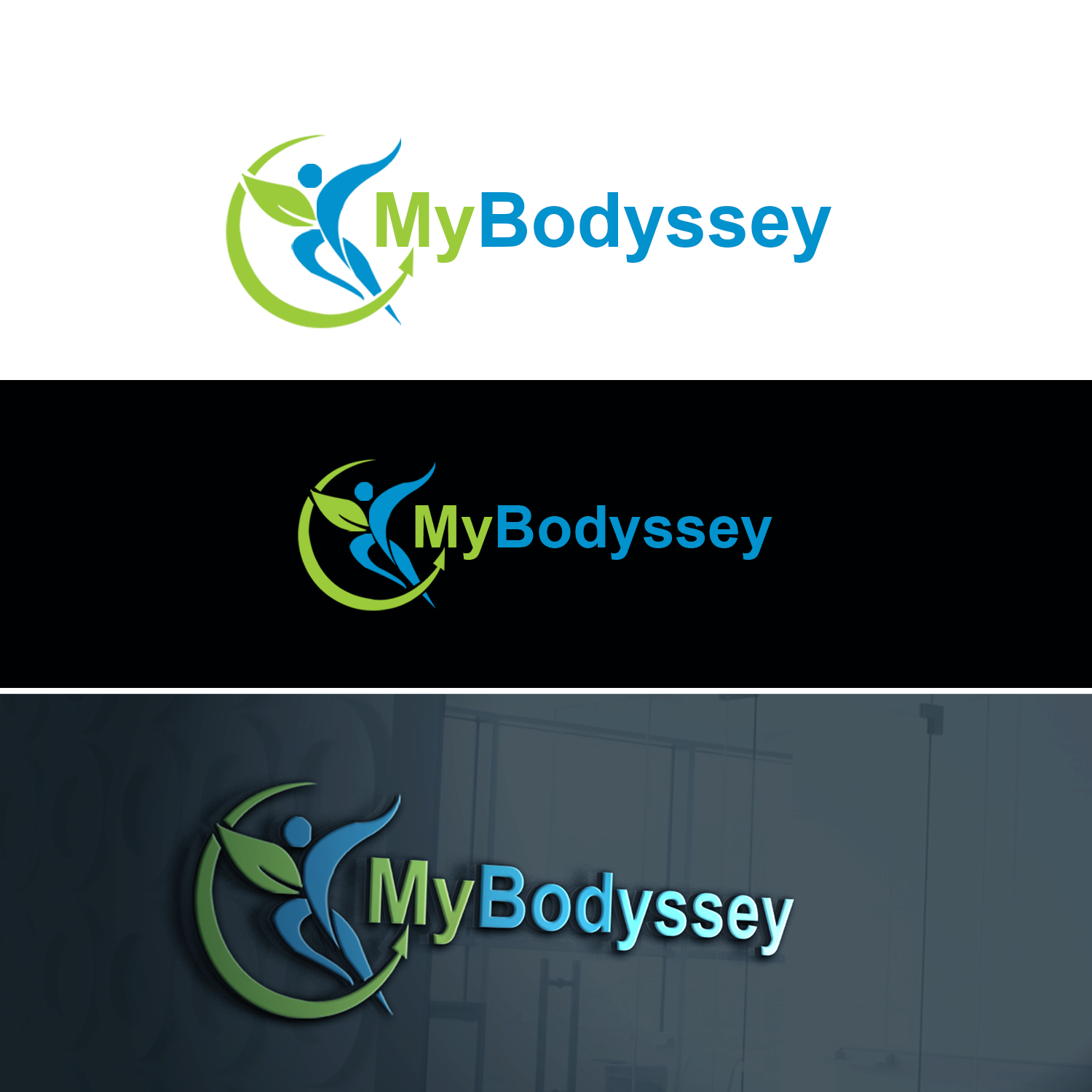
Health and wellness/weight-loss - MyBodyssey, journey to exceptional health

Want to win a job like this?
This customer received 127 logo designs from 31 designers. They chose this logo design from designerworld1 as the winning design.
Join for free Find Design Jobs- Guaranteed
Logo Design Brief
I am creating a health and wellness business, focused primarily on weight loss and the "journey to a healthy weight" and life long wellness. Hence the name being an amalgamation of "Body" & "Odyssey". I would prefer use of the colors blue and green, and some sort of symbol/image in the logo so that it is more than just text. The business promotes plant based eating, so the use of a person/leaf in the logo is an idea I had. I am including some example files just for inspiration, but I am looking for original images. I like the idea of the person being blue, walking or running, inlayed with the leaf in green. Another idea was to incorporate a water drop in blue, with leaves in green (possibly two green tones), then a person (person can be additional color). The logo should convey health, wellness, vitality. The business will primarily be online with info products and coaching services.
Target Market(s)
Weight loss clients, health and wellness seekers, individuals, online sales.
Industry/Entity Type
Health And Wellness
Logo Text
MyBodyssey
Logo styles of interest
Abstract Logo
Conceptual / symbolic (optional text)
Colors
Colors selected by the customer to be used in the logo design:
Look and feel
Each slider illustrates characteristics of the customer's brand and the style your logo design should communicate.
Elegant
Bold
Playful
Serious
Traditional
Modern
Personable
Professional
Feminine
Masculine
Colorful
Conservative
Economical
Upmarket
Requirements
Must have
- Symbol/image, depicting leaf(leaves) in green and a symbolic person, possibly moving/running in a different color. Logo must use blue and green, if additional color used use magenta/pinkish color as from color suggestions.
Nice to have
- Water drop inclusive with leaf/person. Possibly inlayed/overlayed over medical cross, as in sample files.
Should not have
- UPDATE: Eliminating the pink from logo, also would rather not have a capital "O" after seeing initial designs.