Logo needed by new IT consultancy startup
Want to win a job like this?
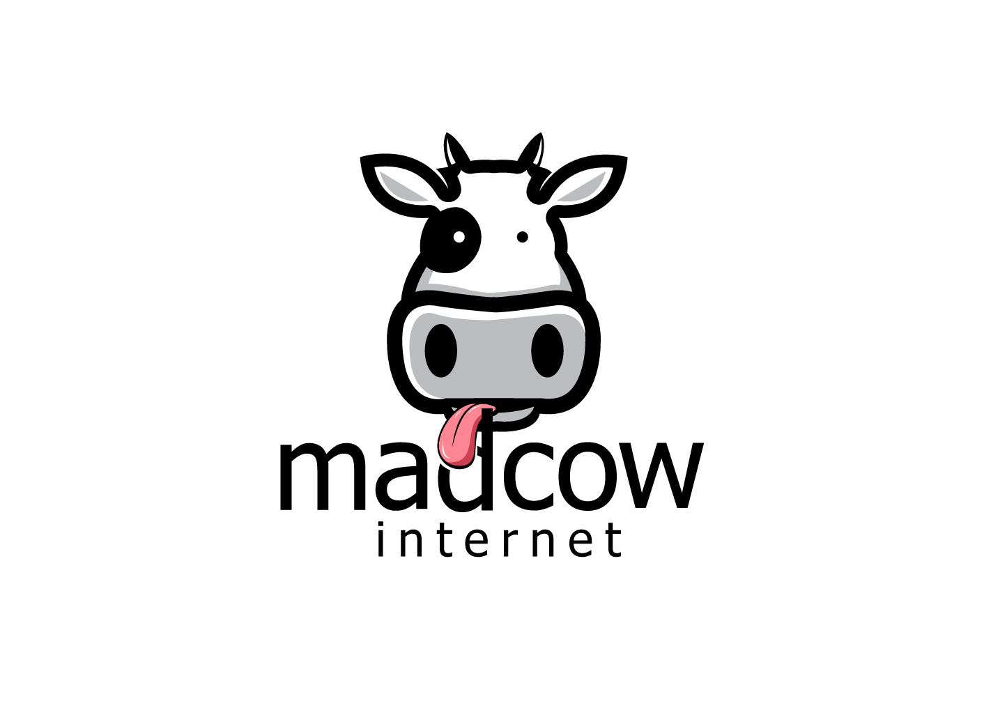
This customer received 75 logo designs from 18 designers. They chose this logo design from hih7 as the winning design.
Join for free Find Design Jobs- Guaranteed
-
 £140
£140
-
 75 designs
-
 18 designers
Logo Design Brief
The company name is "Madcowinternet Ltd", which tends to get written as "MadCowInternet". The company currently provides specialised consultancy services to redesign business processes to use online forms. Future services could be more varied but will revolve around internet technologies.
The company name comes from the owner's initials "CJD".
I'm not necessarily looking for a picture of a cow in the logo, but if you can incorporate a cow, that looks slightly deranged, in a clean, modern way that still makes the company look professional... you're probably onto a winner.
Colours-wise, black and white is the obvious approach. We also like shades of blue.
Target Market(s)
IT professionals and people that make decisions about spending tens of thousands of pounds on consultancy services.
Industry/Entity Type
Consulting
Logo Text
madcowinternet
Logo styles of interest
Pictorial/Combination Logo
A real-world object (optional text)
Abstract Logo
Conceptual / symbolic (optional text)
Font styles to use
Look and feel
Each slider illustrates characteristics of the customer's brand and the style your logo design should communicate.
Elegant
Bold
Playful
Serious
Traditional
Modern
Personable
Professional
Feminine
Masculine
Colorful
Conservative
Economical
Upmarket
Requirements
Must have
- text that says "madcowinternet" - you can choose the case it's written in and I'm not averse to the name being broken into two or maybe even three words (it's a long name, sorry that makes it difficult).
- Clean, professional design.
Nice to have
- Designs that work with both "madcowinternet" and "madcowinternet ltd"
- Some sort of image of a mad cow.
- Tahoma or similar font
Should not have
- Too many colours
- >> An image sat on top of a single line of text. I want to see the text and the image feel as if they are a single design rather than an image plopped on top of the company name.