Logo for small engineering design and development firm
Want to win a job like this?
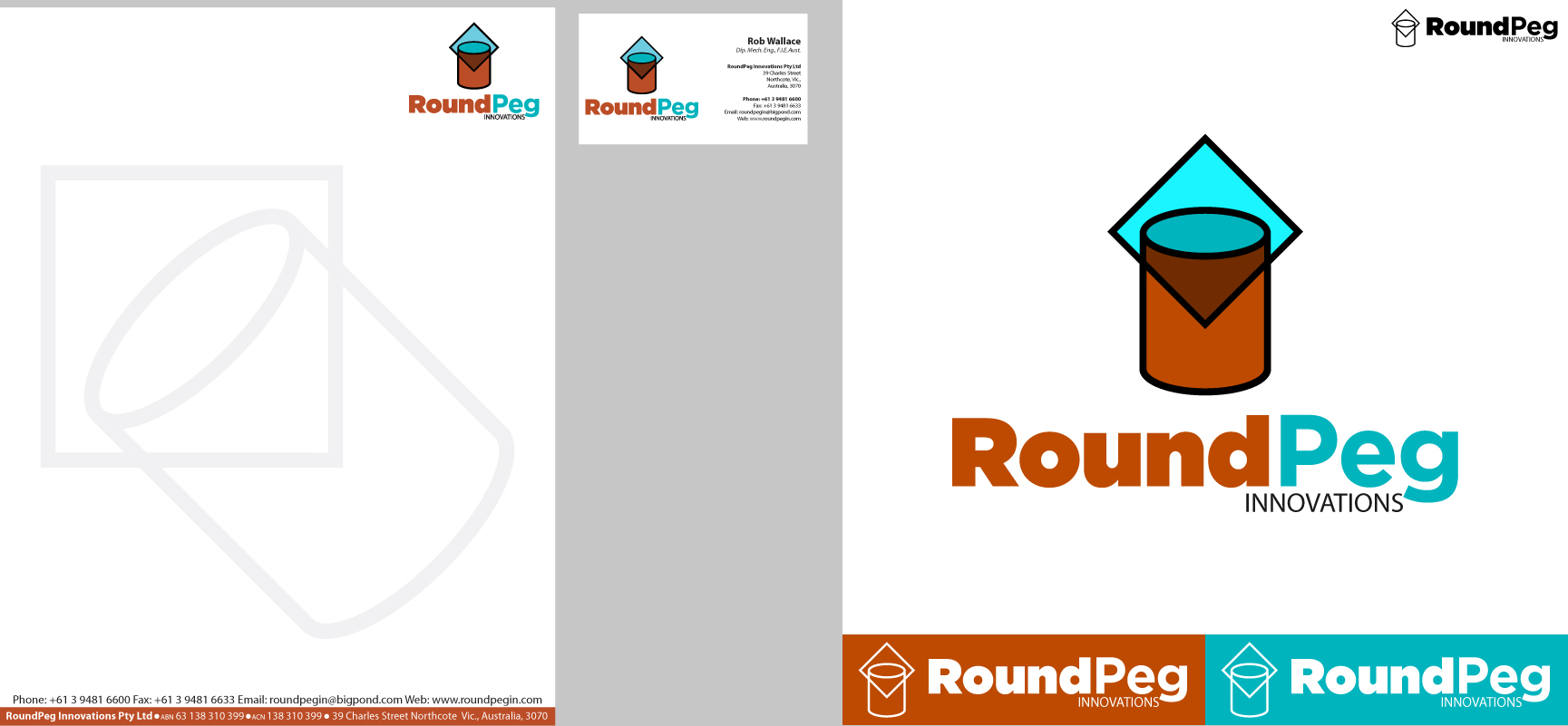
This customer received 37 logo designs from 21 designers. They chose this logo design from Ricky Patrick as the winning design.
Join for free Find Design Jobs- Guaranteed
-
 A$300
A$300
-
 37 designs
-
 21 designers
Logo Design Brief
A logo design for business card and letterhead for a small Australian engineering design and development firm.
"RoundPeg" represents that, unlike the saying "square peg in a round hole" which means a misfit, the opposite is not so. In fact a round peg actually fits quite well in a square hole and may well be superior.
"Innovations" represents our approach; look closely, analyse objectively, think laterally, devise technically sound and practical solutions.
Note; we do not make products ourselves, we sell designs, patents, etc..
Updates
Thanks to all designers for theier submissions. There is a wide variety of designs, and a couple are on my short list. However I will reserve judgement, hoping that THE one will show up.
By way of guidance I like the simple geometric ones that show round in square, thinking outside the square, etc. Round pegs in square holes are quite practical as can be seen with those removeable round posts in square holes in concrete paths - they don't jam like round posts in round holes.
Come to think of it it's not only square holes either; round pegs can fit in triangular, pentagonal, hexagonal holes quite well too.
Lastly, please make sure that the logo can be photocopied; some logos become just a blob with black & white photocoping.
Regards,
Rob
Target Market(s)
Corporate executives, government officials, financiers, university staff. Mainly middle-aged male, university educated, probably located in first world countries in N America, Europe, Asia.
Industry/Entity Type
Manufacturing
Logo Text
RoundPeg Innovations Pty Ltd
Logo styles of interest
Pictorial/Combination Logo
A real-world object (optional text)
Abstract Logo
Conceptual / symbolic (optional text)
Requirements
Nice to have
- Preferred colours are orange, and turquoise (50% of people would call it green, 50% blue.
Black or dark blue would be good for details (address, phone, etc.) on the letterhead and business card.
Should not have
- Anything that may be disliked or offensive to conservative businessmen & government officials.