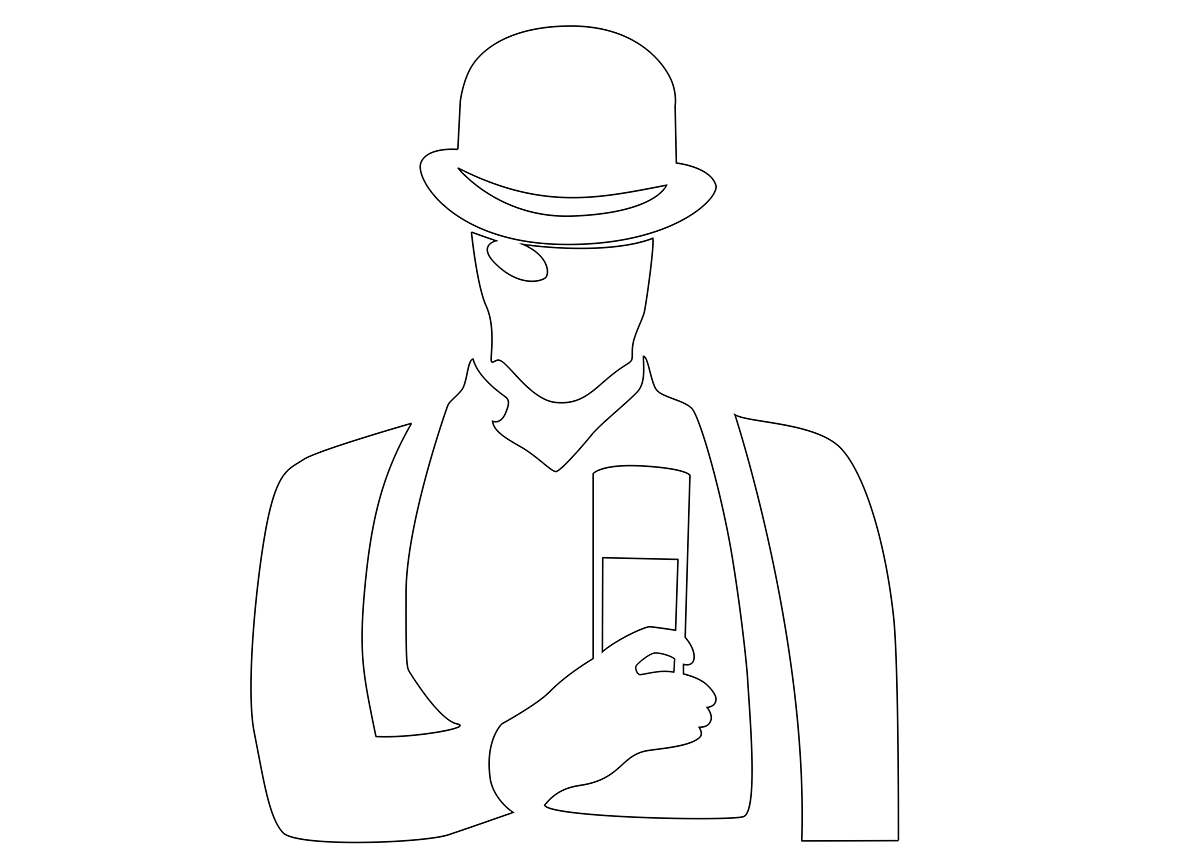
A Clockwork Orange - Silhouette / Text based Poster!
Want to win a job like this?
This customer received 45 poster designs from 16 designers. They chose this poster design from martin.gerhat as the winning design.
Join for free Find Design Jobs- Guaranteed
-
 £205
£205
-
 45 designs
-
 16 designers
Poster Design Brief
Spineless Classics are prints of entire book texts on posters. We've spent the last few years building up a reputation for high quality, sensitively crafted prints and now we've got some really exciting titles to work with we want your ideas.
Examples on our site www.spinelessclassics.com
We take the complete book, with all the paragraphs, and lay it out in columns of 4pt text. To make it fit the sheet fully, we wrap it around (or inside) a striking silhouette image. It is this silhouette you will be designing.
-IMPORTANT-
You will not be working with the text to produce a finished product, but submitting a path outline which we will use to create the actual piece.
-IMPORTANT-
While our core range is based around classic black and white, we are open to the use of colour. However, Less is definitely more and we want the book to speak for itself rather than show off your most intricate design abilities. The idea is to communicate a strong concept with as simple a design as possible.
Your design should show a good familiarity with the book itself rather than merely illustrating the title. Ideally, people who have read the book should recognise something which is not obvious to those who have not.
Other than that, the sky is the limit and with distribution across four continents your design has the potential to be on walls across the world.
Industry/Entity Type
Building
Look and feel
Each slider illustrates characteristics of the customer's brand and the style your logo design should communicate.
Elegant
Bold
Playful
Serious
Traditional
Modern
Personable
Professional
Feminine
Masculine
Colorful
Conservative
Economical
Upmarket
Requirements
Must have
- Ideally, we need a pathed file which can be imported into Adobe Creative Suite. AI files are perfect. Alternatively, you may provide a high-res bitmap which we can trace but it must have clear, sharp edges. A scan of a pencil sketch is just making more work at our end.
Nice to have
- Because we keep the paragraphs your design cannot be too detailed. Short lines, some dialogue or a chapter heading can make the edges of your shapes appear ragged and will make small details disappear. We're looking for bold and recogniseable shapes rather than patterns or complex compositions.
Due to the nature of the columns, bear in mind that thin lines (especially diagonal lines) can break up the text and make it hard to read. If you do want to include detail (e.g. a face) then it should be close to vertical and should face towards the right. A face looking down will cause words to be split up too much and a face looking left will lose detail where there are short lines of dialogue.
Should not have
- Please avoid any imagery specifically associated with the film and its marketing as we will run into legal trouble if recycling any of the ideas that were added then, rather than taken from the text - the bubble font, the cog-eye, the eyeballs on sleeves etc. It might be worth revisiting the original text if you want to be faithful with regard to objects or characters you want to depict.