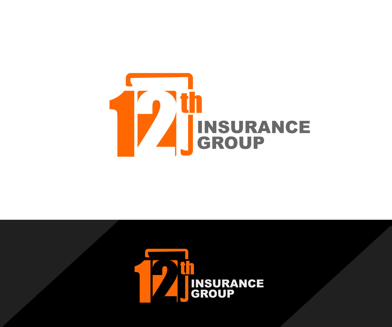
the 12th main logo, the one logo that will differentiate us from the competition
Want to win a job like this?
This customer received 115 logo designs from 35 designers. They chose this logo design from edong artwork as the winning design.
Join for free Find Design Jobs- Guaranteed
-
 US$310
-
 115 designs
-
 35 designers
Logo Design Brief
i need the main logo for my business, the one that's going to be displayed everywhere.. front door, business cards, letter heads, etc.. i engage in the sale of life and health products and have created my d.b.a. as 12th insurance group, don't ask me why i just like how it sounds, attached is sample i've created using really simple tools, the one thing i want to keep intact is the orange background using the same color and the white lettering, i really like the color combination, everything else i'm open for suggestions, thank you..
Target Market(s)
the main trade area is located in el paso, tx witch is pretty much made up of 70% latino/hispanic population, and my intent is to target all age groups 20 and up, for the sale of life&health insurance products.
Industry/Entity Type
Life Insurance
Logo Text
12th insurance group
Logo styles of interest
Wordmark Logo
Word or name based logo (text only)
Lettermark Logo
Acronym or letter based logo (text only)
Font styles to use
Other font styles liked:
- the fonts are explained in the "must haves" sections
Look and feel
Each slider illustrates characteristics of the customer's brand and the style your logo design should communicate.
Elegant
Bold
Playful
Serious
Traditional
Modern
Personable
Professional
Feminine
Masculine
Colorful
Conservative
Economical
Upmarket
Requirements
Must have
- the color must be intact.. i like the contrast between the orange and white.. i have the exact orange i used in a file and can make that available at any time.. obviously the the numbers.. on these i'm open to suggestions as far as fonts.. i used Gill Sans MT Condensed for no 2 & Segoe UI Symbol for no 1.. the letters is up to you.. to be hones i really liked the font used by the 5 gum, i was trying to get as close as the font used in that logo for the "12" is really modern in my opinion.. and definitely have a square aspect to it like the square surrounding the 12.. 10/29 after seeing a few of the designs submitted i definitely know that the logo should be rectangular, meaning having the the words "insurance" to the right of the "12" and "group" underneath" "insurance"..
Nice to have
- one i idea i had and again this is just an idea i dont want to make it the whole project have this is kind of create like a cube where the 1 is on one face and the 2 on the other, and have them alternate colors like the 1 be in white with an orange on the background and the 2 be oarange and a white backgound..
Should not have
- no sure.. i guess i'm open to all suggestions..