G & J Learning Center Rebranding
Winner
Want to win a job like this?
This customer received 55 logo designs from 20 designers. They chose this logo design from Artshit as the winning design.
Join for free Find Design Jobs-
 US$160
-
 55 designs
-
 20 designers
Logo Design Brief
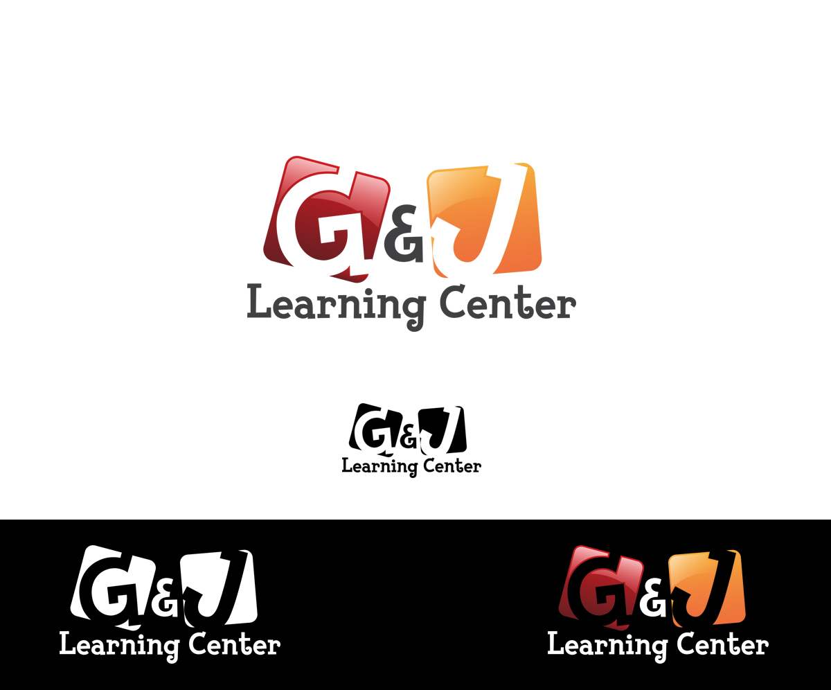
G & J Learning Center is a small preschool in Dallas, TX. The school is an accredited preschool, meaning they are not just babysitters, but rather have a curriculum/interactions at each age to ensure children meet developmental milestones from 6 wks - 12 years. They are in a lower income part of Dallas, surrounded by competitors who have typical 'daycare' graphics. We would like something bolder and more distinctive, yet still fun and child friendly, to set them apart and make them unique.
Target Market(s)
Parents of infant - preschool children
Industry/Entity Type
Preschool
Logo Text
G & J Learning Center
Look and feel
Each slider illustrates characteristics of the customer's brand and the style your logo design should communicate.
Elegant
Bold
Playful
Serious
Traditional
Modern
Personable
Professional
Feminine
Masculine
Colorful
Conservative
Economical
Upmarket
Requirements
Must have
- The logo will need to work for signage, printed materials, online marketing and staff uniform shirts. A color and b & w version is needed.
Nice to have
- I would like to see a very graphic use of the G&J letters in a fun, colorful way that would lend itself to signage and other uses.
Should not have
- As a preschool, the look should be fun and child friendly, (not too corporate) but also not the standard child care look with handprints, toys etc.
Payments
1st place
US$160