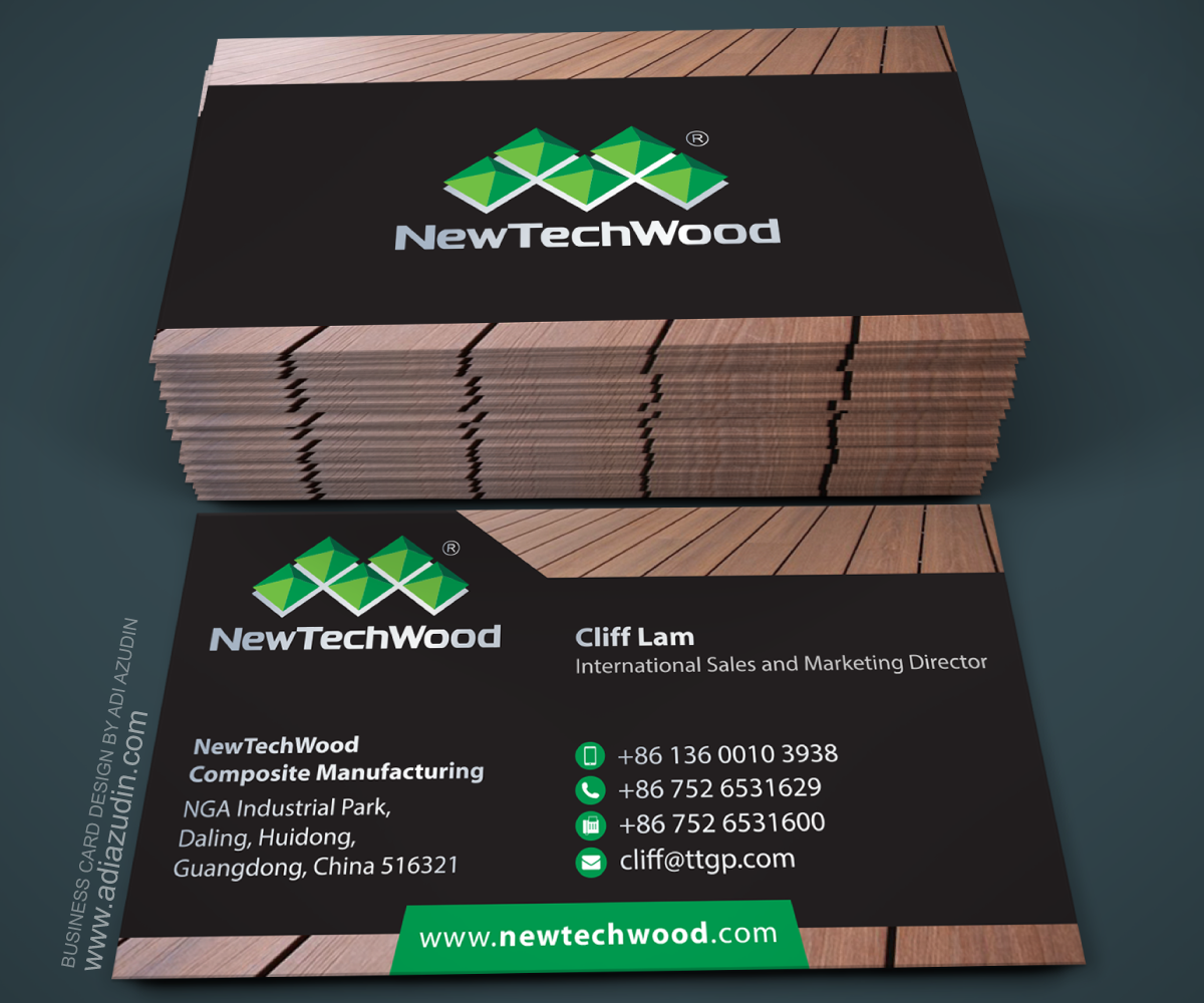
NewTechWood Wood Plastic Composite Manufacturer Business Card
Want to win a job like this?
This customer received 184 business card designs from 20 designers. They chose this business card design from adiazudin as the winning design.
Join for free Find Design Jobs- Guaranteed
-
 US$150
-
 184 designs
-
 20 designers
Business Card Design Brief
We need to update our business card from what it is was before, because I believe it is a little to casual on our original card it didn't look as professional as we wanted.
We want something that shows we are professionals in our industry. The industry we are in is wood plastic composite manufacturing. The product is 99% recyclable and is used for outdoor decking, railing, fencing, and etc. You can get more information at our website at www.newtechwood.com
Our company colors are: green, black, and white the NewTechWood with the diamonds is our logo and UltraShield is a line of a product that we sell.
I have attached the card that we use now so you can see what it looks like now. The QR code on the back was used as a straight to email scan. Right now I just feel like the card is really crowded because maybe there is too much information, but some how we need all of it but it needs to be displayed in a more organized and professional manner and also with an easier text for the eyes to read because it might be smaller due to the amount of information.
Target Market(s)
Distributors in the outdoor industry, contractors, and end users.
Industry/Entity Type
Business
Contact Information for Business Card
Name of the person on the card
Position of the person
Address of the manufacturing facility
NewTechWood logo with diamonds
Website Address
Telephone Number
Celephone Number
Fax Number
Look and feel
Each slider illustrates characteristics of the customer's brand and the style your logo design should communicate.
Elegant
Bold
Playful
Serious
Traditional
Modern
Personable
Professional
Feminine
Masculine
Colorful
Conservative
Economical
Upmarket
Requirements
Must have
- Make sure the text is readable as well the last font we had was just really hard to read on the eyes.
Nice to have
- I want it to stand out more, so it has to have some flare to it but to emphasize that we are professional.
Should not have
- It should not have any colors that are not our colors which are: black, white, and green.