Child Activity Courses Flyer with Free Post Slip
Want to win a job like this?
This customer received 27 flyer designs from 11 designers. They chose this flyer design from hih7 as the winning design.
Join for free Find Design Jobs-
 £95
£95
-
 27 designs
-
 11 designers
Flyer Design Brief
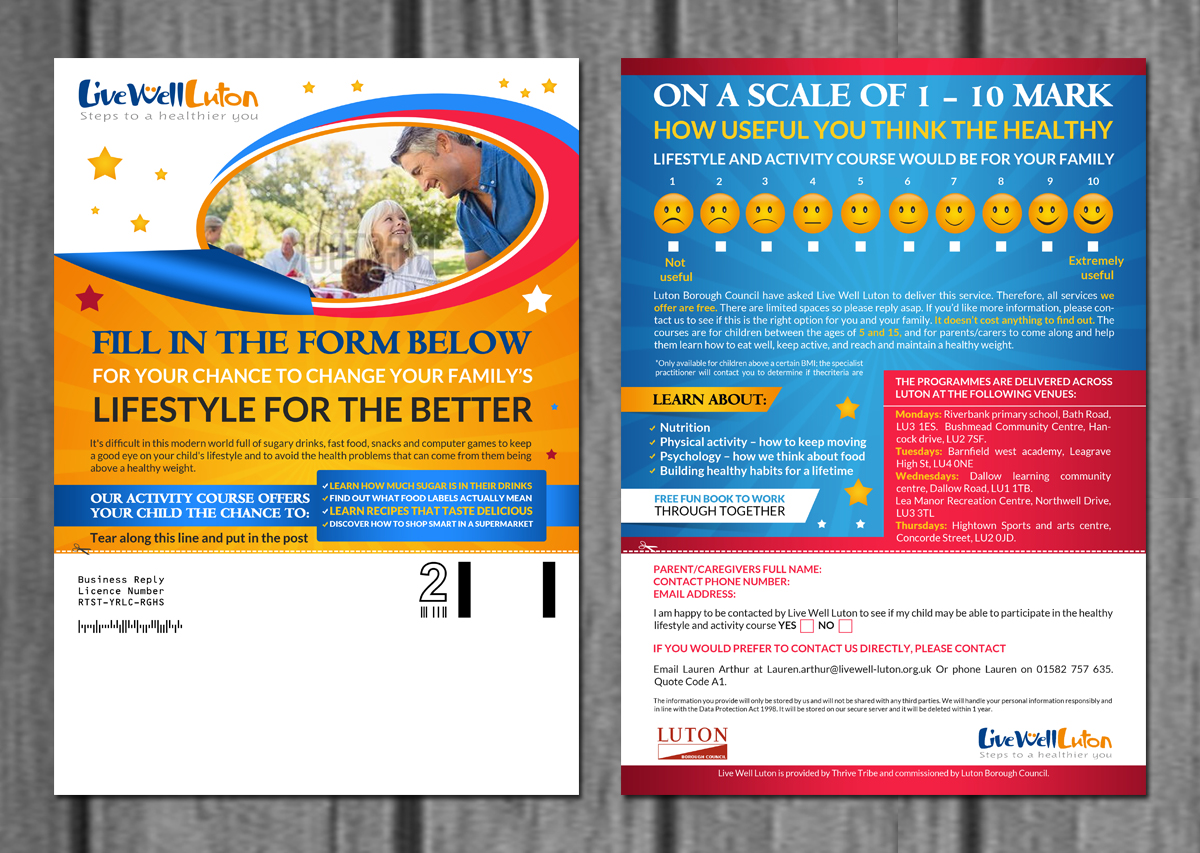
An A4 double sided flyer with a perforated tear off FREE POST slip at the bottom.
LOOK AT THE PDF EXAMPLE PROVIDED: Obviously, it shouldn’t look like this. But this has all the content in the rough layout we are after. We want it to look colourful, awesome, have pictures on it, and be generally attention-grabbing and attractive.
This flyer advertises our Child Activity and Healthy Eating Courses. These courses are given for free for children who are over a certain weight, for them and their parents to come once a week for 6 – 12 weeks, for a session learning about good healthy eating habits, physical activity, cooking healthy meals, etc.
The flyer should be colourful, attract attention, and in a visual way portray the positive benefits of the service; it should seem a fun, attractive course. It is aimed primarily at the parents as they will be the decision makers here, however it is being put into child’s bookbags (ages 5 – 12), so something that stands out to children - perhaps that they want to give their parents - is also good.
The main aim – and the design should support this – is for it to stand out, for parents to read the whole thing, and for it to look like an inviting slip that Parents want to send back to us. The purpose is to get as many returns - them tearing off the slip - as possible. The artwork should therefore have a clear visual segmentation that invites reading - a clear headline that leads onto the text body, and should be easy to read. (the text shouldn't be divided up all over the place, or at angles or anything else "stylistic" that actually makes it more difficult to read). The images should also have a clear purpose and not be there just for the sake of it (images could be whatever works best, might only be one single image...).
For this project we also need the original indesign or illustrator files as we will want to be able to edit some details for future editions.
Notice on the "smiley faces" for the question, these should go from UNHAPPY to HAPPY, or some other indication of "not useful" (1) up to "extremely useful" (2)
Target Market(s)
Parents of children aged 5 - 12 (all parents, but especially those whose children have high BMI or an above healthy weight)
Industry/Entity Type
Health And Wellness
Look and feel
Each slider illustrates characteristics of the customer's brand and the style your logo design should communicate.
Elegant
Bold
Playful
Serious
Traditional
Modern
Personable
Professional
Feminine
Masculine
Colorful
Conservative
Economical
Upmarket
Requirements
Must have
- All the wording shown in the PDF file attached. Also, probably in that layout as well. Unless there is a layout that you find works better to encourage everything to be read.
Should not have
- Anything that offends parents of overweight children
_brief254419.png?AWSAccessKeyId=ASIARQT47ZIUW6GCTBTK&Expires=1771870234&response-content-disposition=attachment%3Bfilename%3D%22LWL%20Logo%20CMYK%20%28legacy%29%20Tuesday%2C%2025%20August%202015%2016_44_19.png%22&x-amz-security-token=IQoJb3JpZ2luX2VjEP%2F%2F%2F%2F%2F%2F%2F%2F%2F%2F%2FwEaCXVzLWVhc3QtMSJHMEUCIQCuidXMuwyLVN65mSfGy8kBJgiI3tpvO9EFvJ3IVvCRBwIgJXWiFwzuttvmEWzh5ohawoRBtvPlmYnl5yT7K9PhnvMq9AMIyP%2F%2F%2F%2F%2F%2F%2F%2F%2F%2FARAAGgwxMDQ0MTUwODcxNDUiDErqa2bCeMUDw9w%2F3irIA86Rilqocrn4cq6nD%2BB0DI7leGE4rrTUa2021MWwF8VGa6Nn4xOdeCqj91ibCzBUYGfFrSGZjUIw%2BFqtpYF7PYmTLD%2BxPwnszw9Beq%2BAi%2FdX2T4c3i172V72oT7jjwT7OUxbICCI%2BTKhKQ%2Fhopg1b%2FCOh%2BI8Tnxf0C%2F6n9DOoIZGeB%2FiMZ%2B5thXDUA1hFY7DZriPsZvdriD4WrwzKMjHh8%2By3hPHeR7D608T88ThV05UB1z%2BL8rcxTg4EpO53BtIZYQ0735cnN2OxHIqU%2BKjDzVYYHmN%2FInus3QS%2FSS7zZ1jLHEoU1Gxmymmt%2FmXZZcptZt1XRiSLstSGg3Sxv%2FmsFM1vgXeen8Gr2Sehzmh2a%2BGP3qdTFVa9jscnu%2FA0DLCI4Sbaf20o5XA%2BBQUYY%2FATYYJK6Uc%2Fqwl4Qyh1wqwwN0flo054tgYUsKP6CWcP2r53YOXhjckLvTyOLianqw4DqgLpsMEhlhxidCg3YfAUdZcWLUQxd2Rr7laK4PcoGqZXl3fzVqlkBImLaXcv3AbGVYcciXoRpAlv2E0AlJc7R0svtAiquaoEN5HEDkXItDJO%2BkQBbrHv3sGFAXpWRFtEmZ%2BxIPylLKz%2FDDerezMBjqlAdCyRrDzThZZ%2FHCCLyU3nz3VMj3tsQ7wMdLy%2BDRKsn02VLlbuilokQlFpH0z%2BUYpHBhXFrLZ%2BzYftwu0eVcEuaBaIZKiFgOH38DSm49nZdrBRs%2FlzMqYxIARyD7ongYg4ee2YFB03cz8gBMu0vhaMgL0MgROOyTBSL5i52mrAUlf0JADJvcb%2BqvJBK7KbqjOdGTL4oyrj5%2FygiTGnZNC8QYbfvu1Hg%3D%3D&Signature=U3SpA6VFEoaPegClUFl2aoHp9E8%3D)