P2P Logo Design Project
Want to win a job like this?
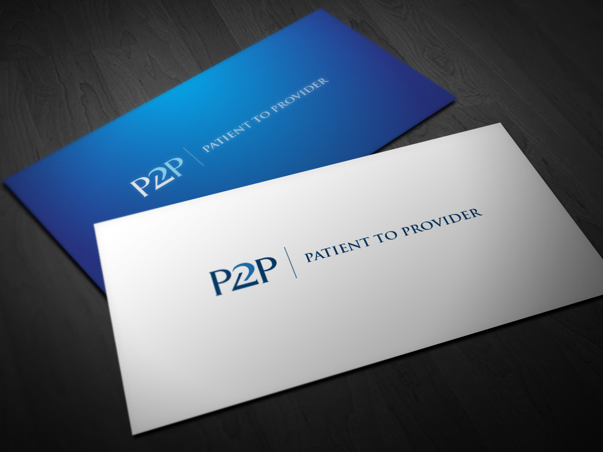
This customer received 104 logo designs from 37 designers. They chose this logo design from Alchemist as the winning design.
Join for free Find Design Jobs- Guaranteed
-
 US$200
-
 104 designs
-
 37 designers
Logo Design Brief
The P2P is an assessment instrument that is administered to patients in a medical office. The logo will be visible online while the patient answers the questions and will appear on a printed report for the doctor's office. So, it should look nice online and print well in color or black and white.
The main purpose of the instrument is to provide patients an opportunity to communicate to their doctors their attitudes, preferences and opinions about their medical care, and the communication style they prefer from their doctors. Thus, P2P stands for “Patient to Provider.”
Since the atmosphere is a medical setting, we are looking for a clean, professional, simple logo that also incorporates the concept of communication and connectedness.
We would like the P2P letters/number to be "connected" and "interacting"
Updates
The project was changed to commit to payment. A logo will be selected.
Added Thursday, May 02, 2013
Project Deadline Extended
Reason: No more designs needed we are balloting and then will select shortly
Added Friday, May 24, 2013
Target Market(s)
Medical Practices and their Patients
Industry/Entity Type
Communication
Logo Text
Patient to Provider
Logo styles of interest
Emblem Logo
Logo enclosed in a shape
Lettermark Logo
Acronym or letter based logo (text only)
Look and feel
Each slider illustrates characteristics of the customer's brand and the style your logo design should communicate.
Elegant
Bold
Playful
Serious
Traditional
Modern
Personable
Professional
Feminine
Masculine
Colorful
Conservative
Economical
Upmarket
Requirements
Nice to have
- Attached file gives an idea of the "feel" we're looking for. The focus is on the "P2P" with the design subtly connoting the concept of connection and collaboration.