Digital Marketing Agency Logo Design
Want to win a job like this?
This customer received 118 logo designs from 29 designers. They chose this logo design from Fanol Ademi as the winning design.
Join for free Find Design Jobs-
 US$420
-
 118 designs
-
 29 designers
Logo Design Brief
We are a Seattle-based digital media agency, specializing in planning, execution and analysis of cross-channel digital marketing campaigns. We manage display, video, social, mobile and search campaigns and provide in-depth analysis for high-profile brand advertisers.
The name Hi Pop! comes from my childhood. I grew up in the 70's and my grandpa had an old dirt floor garage with exposed plank wood walls inside. Spray-painted on the wall in blue paint was "Hi Pop!" When we asked her about it, my Mom didn't recall it but figures she must have done that as a message to her dad (my grandpa) years before. The paint brush style font in our early versions was an homage to that.
Target Market(s)
Some of our target clients are premier university business schools, major performing arts groups, professional sports teams - prestigious brands.
Industry/Entity Type
Advertising
Logo Text
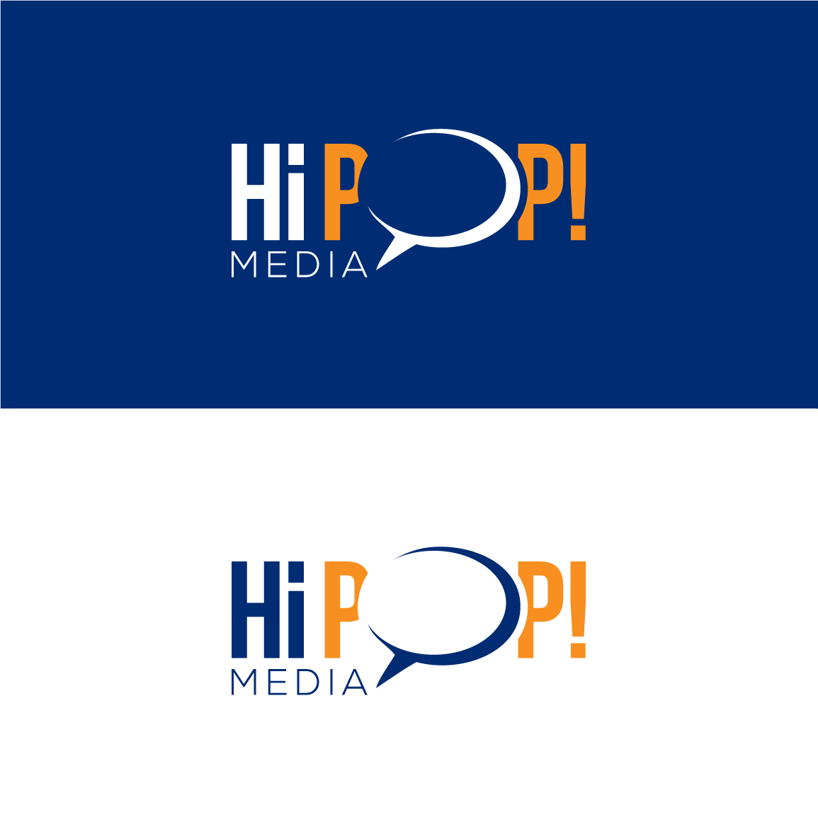
Hi Pop! Media
Logo styles of interest
Emblem Logo
Logo enclosed in a shape
Pictorial/Combination Logo
A real-world object (optional text)
Wordmark Logo
Word or name based logo (text only)
Font styles to use
Colors
Colors selected by the customer to be used in the logo design:
Look and feel
Each slider illustrates characteristics of the customer's brand and the style your logo design should communicate.
Elegant
Bold
Playful
Serious
Traditional
Modern
Personable
Professional
Feminine
Masculine
Colorful
Conservative
Economical
Upmarket
Requirements
Must have
- Our website is in development at test.hipopmedia.com and will have a comic book feel to it based on our early direction with the logo. We like the quote bubble as a symbol of the ongoing conversation we have with our clients and are trying to achieve a cool Lichtenstein/Ben-Day look to our logo.
- All "i's" must be lower case
Nice to have
- Characteristics of the attached images we like:
- "Pop!" - Ben Day treatment in the fill of the font
- "Hi Pop! Spacing" - spacing of the words to the bubble
- "HiPOP (Revision) - dual color and brush stroke/comic font
- "LogoBURST" - bold lines and colors
Should not have
- Our early versions made people think our name was pronounced "hippop" instead of "Hi Pop!" We also had concerns that the word media could not be seen in the exclamation point, so need to make sure it's visible but secondary to "Hi Pop!"
_brief033224.png?AWSAccessKeyId=ASIARQT47ZIUZZWZDDP2&Expires=1771917303&response-content-disposition=attachment%3Bfilename%3D%22HiPOP%28Revision%29%20Friday%2C%2003%20July%202015%2023_32_24.png%22&x-amz-security-token=IQoJb3JpZ2luX2VjEAoaCXVzLWVhc3QtMSJHMEUCIBunNDvbKEE%2FQUAn7fFq%2F3S6gLmUmSzvAeyv342Nox%2BnAiEAv66vV0Tr1sI8Bp43SpQCfPcdzBGW8jJy683LCu2nUMwq9AMI0%2F%2F%2F%2F%2F%2F%2F%2F%2F%2F%2FARAAGgwxMDQ0MTUwODcxNDUiDOL6%2F7aWiCe9RuPbGyrIAzDCEf3vMXsZcfk3qy4T33%2Fwkhmc%2FwdtjgjRY20gCbKPyS2%2FWp1NS3ncy%2B5KEyH7DgsPT2KgGke7pO%2FAQKfM0sTTsILOpDcfYXs8yWJTj59BgMIQvqZHsu2nrBlD7zf7ZNesu7Pbckr8TWooeWwdxPPPzGdfkqe87wgE1ZEjtSihsRd7%2BOwZgDGuvuAwohJ6GdyIQ0sqf%2B1M6dGa971d%2BDEWU0v3bF1xY%2BFS7JrJJMCmjEN%2FDDoqV50GwNv9TpL14GjKJmEsLGnbR4IlBicRj2Rh5USnYtpJcM4qj1e%2F8PiK4DKC3C3ICZR1dGXozdqh%2BG2xtIDp67NhEir%2BovfGucN0ixuTH20Fftl7%2FpijdF2BpOJFdPt673vhfpbXKAhfR3l8ZoaRLml9x7cntqo4ebQ49mKrEHvPRXz7%2FquOAINN%2FgOXkGwYDmOb1iFG2LVlHSBCXWMScjOB%2F6kJbHm0Wt6QWyk72T6xdf9qc40d%2F%2BRva1DaFydEV%2FhKItJDOcf5m%2FM7Z%2Bte%2FJYfRimuIgOzUd8Eq2%2FpzkDBv32h2HAYUtt6zfHYg9zLC%2FvQFRxmiyVnqeWnzkTf1DZO5yoIjh6uBi0Sat3H0oHDJDDs5e7MBjqlAY2NWtWMgKZbeSVXKRU8Aa45VlbpeNZ4bw7RXPeIgkgkmwWKJ2uE3QUJ9ONSMd2vLISKggb1uZCzJJXD8U20UYsi9EOR2N5%2FnSq0YqjVp6LtGzBKgKH4zydqxkwTEZWyuZfFhzVULct7aLOhzgdawoeWgAP79QMHtZjO04FAkPArCl2qK2S1kC3P%2FryE6RX5xfJEVafxSQSNCKn%2FAasi9GDXS9XBsg%3D%3D&Signature=O%2FCbJEiXnenNns82VZZNI2nUVDY%3D)