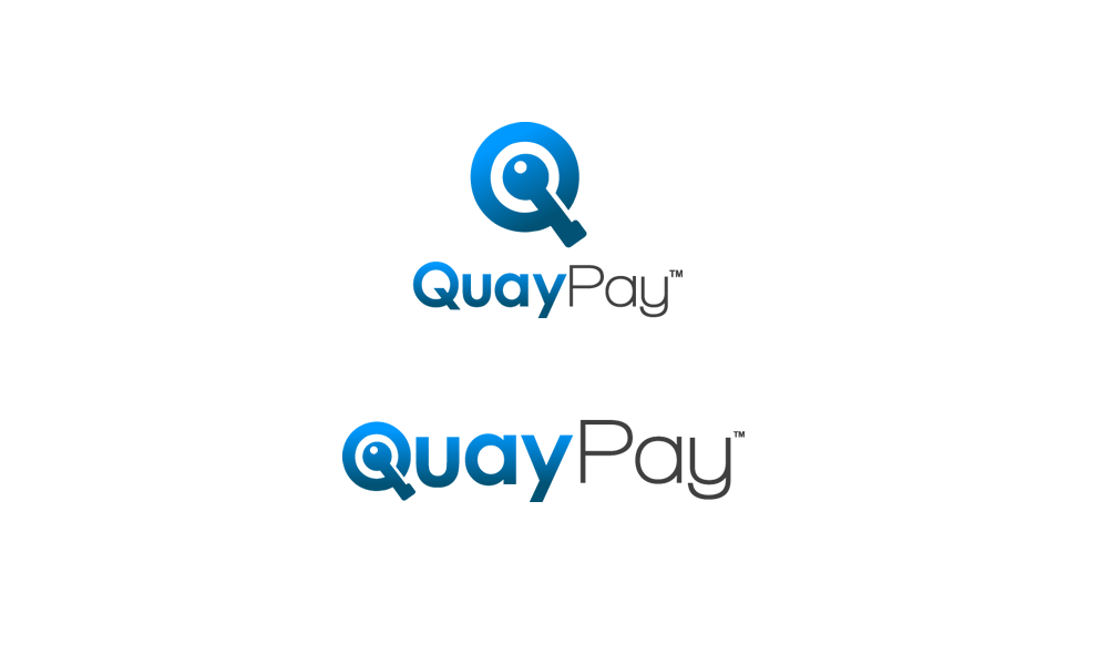
QuayPay Logo Design Project

Want to win a job like this?
This customer received 153 logo designs from 73 designers. They chose this logo design from inspiral as the winning design.
Join for free Find Design Jobs- Guaranteed
Logo Design Brief
We need a logo for our new company based in Sydney called QuayPay. We provide online payment solutions with a focus on the media and publishing market. We have a creative focus on payments and are providing solutions that integrate with digital and physical products in exciting new ways.
Be creative in the logo design but remember online payment is all about trust and security. The colour blue is typical in payment logos as it reflects trust. The 'Quay' in QuayPay is pronounced 'key' so try out a lock or key in the design- but only if you can get it to work. I don't want it to look like a clipart key or pad lock.
The final design should be flexible enough to work on the web, mobile and in print.
Updates
Hi All, It's looking great so far. I've sent all the logo designs to my small team to review this afternoon. Thanks!
Added Sunday, April 28, 2013
Hi Designers,
Added Wednesday, May 01, 2013
Industry/Entity Type
Digital
Logo Text
QuayPay
Logo styles of interest
Pictorial/Combination Logo
A real-world object (optional text)
Wordmark Logo
Word or name based logo (text only)