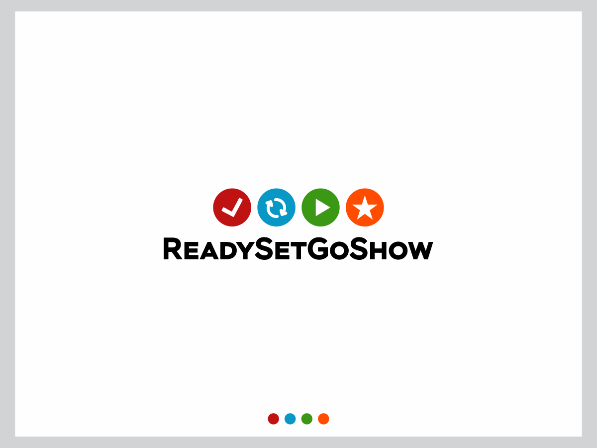
Logo for ReadySetGoShow website
Want to win a job like this?
This customer received 92 logo designs from 28 designers. They chose this logo design from Natasa_Radulovic as the winning design.
Join for free Find Design Jobs- Guaranteed
-
 A$245
A$245
-
 92 designs
-
 28 designers
Logo Design Brief
I need a LOGO for a new website dedicated to promoting the Ready-Set-Go-Show model and my associated training/consulting services.
The Ready-Set-Go-Show model is a practical, research-based model that explains the key phases/components of effective training programs and self-managed learning initiatives. See the uploaded ReadySetGoShow Model pdf for a draft copy.
I am looking for a simple and clever logo that uses the name of the website: ReadySetGoShow.com
I don't have any definite colours in mind for the logo. As far as the website is concerned, I like colours such as those used in this theme: http://www.elegantthemes.com/demo/?theme=Divi
See the uploaded ReadySetGoShow Notes pdf for additional information on the Ready-Set-Go-Show model.
Target Market(s)
Learning & Development professionals. This includes trainers, facilitators, and instructional designers / e-learning designers.
Industry/Entity Type
Training
Logo Text
ReadySetGoShow.com
Logo styles of interest
Wordmark Logo
Word or name based logo (text only)
Font styles to use
Look and feel
Each slider illustrates characteristics of the customer's brand and the style your logo design should communicate.
Elegant
Bold
Playful
Serious
Traditional
Modern
Personable
Professional
Feminine
Masculine
Colorful
Conservative
Economical
Upmarket
Requirements
Must have
- A text-based logo that can work if it is reversed out (white only).
- The main aims of the logo are (1) to influence people to remember and recall the name of the model and website address, and (2) to reinforce that there are four distinct, interlinked and equally important phases. This means that the logo name and phases must be easy to discern at a glance.
- 'ReadySetGoShow' must be on one line. [This is because it's both the name of the model and the web address, and because each phase follows the previous phase.]
- I'd like something artistically clever and minimalistic. Here are some examples: http://www.noupe.com/inspiration/showcases/clever-logo-designs-that-speak-for-themselves.html
- Words that come to mind are: professional, meaningful, 'elegantly simple'.
- The explanation on this page captures what I'm aiming for:
- https://medium.com/@saijogeorge/wordmark-logo-design-inspiration-3ab05fc6a47
Nice to have
- Use of small caps. This isn't essential but should be considered.
- I admire clever, impactful logos that have a visual double entendre, such as those shown here: http://designshack.net/articles/graphics/50-fantastically-clever-logos/
Should not have
- Do not use the acronym 'RSGS". And, do not use colour to make the individual RSGS letters stand out. [Each of the four words can be in different colours]
- Do not use arrowheads like the draft model. (The logo should use the 'word' ReadySetGoShow or web address ReadySetGoShow.com)
- Do not turn the logo into a flowchart that is spread out. ReadySetGoShow.com is long enough as it is. [The logo should help people remember/recall the name of the model and website address. The actual model/flowchart will be explained in a whiteboard animation.]
- The logo should not be very elaborate, busy or complicated.
- If included, the ".com" should not be pronounced.