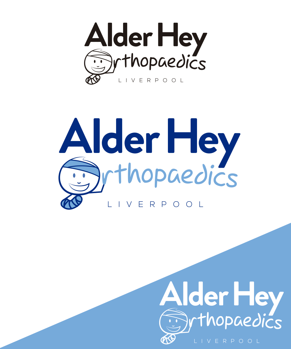
Alder Hey Orthopaedic Surgery Logo
Want to win a job like this?
This customer received 23 logo designs from 11 designers. They chose this logo design from StudioD™ as the winning design.
Join for free Find Design Jobs-
 £240
£240
-
 23 designs
-
 11 designers
Logo Design Brief
Alder Hey Hospital is a large children's hospital in the North West of England.
We need a logo for the orthopaedic (bone) surgery department in this children's hospital.
It would be fun to make the 'O' in orthopaedics into a kids face, and then possibly to have a 'stick' kid lying below it with a cast on his leg. (rough idea attached - it doesn't need to be stuck to it).
We want it to be a little fun, clear to read and set a nice image for our department.
The logo will be used in presentations and on literature.
Target Market(s)
Other doctors
Industry/Entity Type
Health Care
Logo Text
"Alder Hey Orthopaedics"
Logo styles of interest
Character Logo
Logo with illustration or character
Font styles to use
Other font styles liked:
- fun
Look and feel
Each slider illustrates characteristics of the customer's brand and the style your logo design should communicate.
Elegant
Bold
Playful
Serious
Traditional
Modern
Personable
Professional
Feminine
Masculine
Colorful
Conservative
Economical
Upmarket
Requirements
Must have
- "Alder Hey" quite clear to read
- "Orthopaedics" can be a little more fun.
Nice to have
- A stick man, with his head as the 'O' in orthopaedics. The stick man with some injuries (but happy). Make it kid-friendly. Perhaps the man could have a stick body with a plaster cast on his arm/leg. He could be giving a 'thumbs up'.
- You could flip the words over so it reads "Orthopaedics Alder Hey" to enable some room for legs and a body - he could be standing or sitting. He could have some crutches.