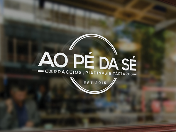
Logo "Ao Pé da Sé" - Restaurant, healthy food, green, portuguese
Want to win a job like this?
This customer received 44 logo designs from 16 designers. They chose this logo design from alex.ronin as the winning design.
Join for free Find Design Jobs-
 €120
€120
-
 44 designs
-
 16 designers
Logo Design Brief
"Ao Pé da Sé" is the name of a restaurant that me and my partners will open in a few weeks. It means "Near the Sé".
Sé is a cathedral very well known in Lisbon.
Is a place that hasn´t license to cook, so we will serve only things that don't need to cook, like carpaccios, tartares, sandwichs and piadinas.
We will have fresh fruit juices, and we want to pass the idea off fresh/natural/ green.
The decoration is based on green, and the idea is that it appears like a garden garage. We tried to use only tipical portuguese materials and autentical, like hydraulic tiles on the floor, portuguese stone for the tables top, the chairs are from a portuguese designer that designs school material...
The files im adding are some elements that helped us on the decoration,
pictures from the building outside, where would be an esplanade.
Target Market(s)
tourists, lisbon young residents
Industry/Entity Type
Restaurant
Logo Text
Ao Pé da Sé
Colors
Colors selected by the customer to be used in the logo design:
Look and feel
Each slider illustrates characteristics of the customer's brand and the style your logo design should communicate.
Elegant
Bold
Playful
Serious
Traditional
Modern
Personable
Professional
Feminine
Masculine
Colorful
Conservative
Economical
Upmarket
Requirements
Must have
- originality, fresh feeling, simple
Nice to have
- I added a picture of the floor with the Hydraulic tiles.
Should not have
- Must not have too much information, we want something really simple... with straight lines, nothing elaborated... maybe just the name...