korean fried chicken restaurant logo
Want to win a job like this?
This customer received 67 graphic designs from 34 designers. They chose this graphic design from DesDesign as the winning design.
Join for free Find Design Jobs- Guaranteed
-
 US$200
-
 67 designs
-
 34 designers
Graphic Design Brief
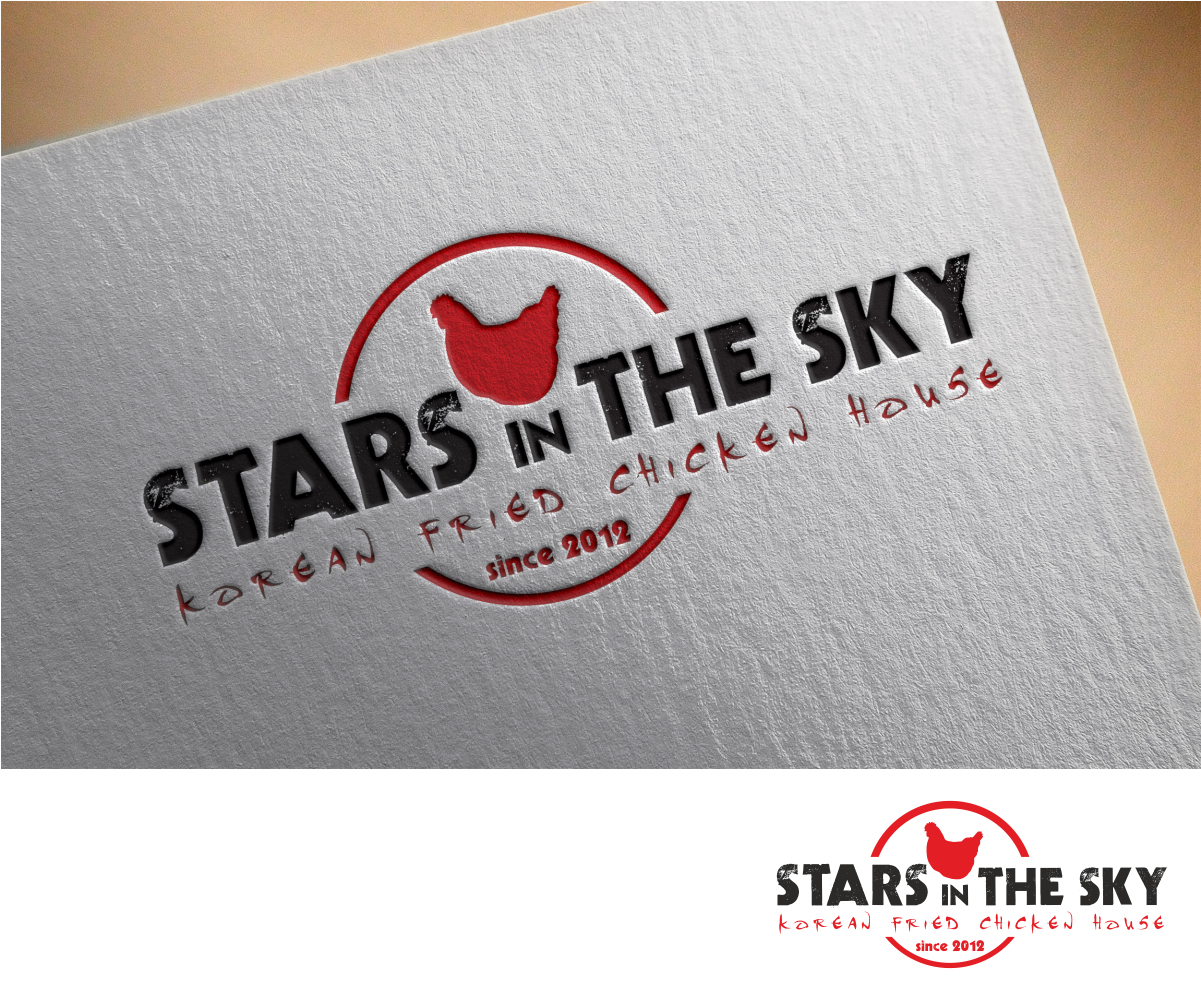
Stars In the Sky is name of my restaurant.
We are specialize on korean fried chicken since 2012.
We are currently have our logo but it doesn't stand out. People having hard time to see from little out from restaurant. and many people think our place is little scatch from outside. haha it hurts my feeling.
I would love to have unique and standing out logo that it will lasts long time and i will use it for every place i own. I would love to have bottom line quoting "KOREAN FRIED CHICKEN HOUSE since 2012"
Thank you!
Updates
Project Deadline Extended Reason: i didn't find the logo I liked. Added Wednesday, December 9, 2015
Target Market(s)
20 to 50
Industry/Entity Type
Restaurant
Font styles to use
Look and feel
Each slider illustrates characteristics of the customer's brand and the style your logo design should communicate.
Elegant
Bold
Playful
Serious
Traditional
Modern
Personable
Professional
Feminine
Masculine
Colorful
Conservative
Economical
Upmarket
Requirements
Must have
- Stars In the Sky(big and bold), design of some kind of chicken.
Nice to have
- quote of "KOREAN FRIED CHICKEN HOUSE since 2012" on the bottom.
Should not have
- not like something you copied from other companies.
- shouldn't look like our old logo.