Simple Technical Chart: Illustrating Progress of Paris Climate Talks
Want to win a job like this?
This customer received 29 graphic designs from 6 designers. They chose this graphic design from Nightmist as the winning design.
Join for free Find Design Jobs- Guaranteed
-
 US$190
-
 29 designs
-
 6 designers
Graphic Design Brief
Produce a simple, no frills, 1 page, clean technical bar chart from a detailed pencil sketch that is provided with this brief.
All images, data, and text is provided with this brief, in the form of a detailed pencil sketch of the bar chart.
Chart to be produced in landscape format, printed at 8.5" x 11"
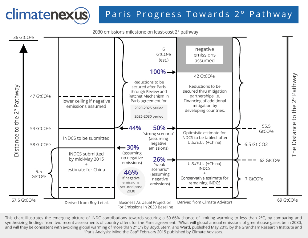
The chart illustrates how the country offers for the upcoming Paris climate agreement add-up.
Countries are currently offering carbon emission reductions that will be the basis for a new international agreement on climate change scheduled for finalization in early December in Paris.
This chart compares the results of two different assessments of how the Paris agreement is shaping up: the Boyd et al. assessment, and the Climate Advisors assessment.
1) The chart should be based on the sketch in the uploaded file labeled: TheWholeComplexStory.
2) In addition, our logo should be added to the chart. The file with that logo is labeled: logohires
3) Finally some extra room should be left at the bottom of the chart of the addition of 1-2 lines of text in the way of a footnote. Those two lines of text will be provided separately. Dummy text can be used in first draft.
The images in the file labeled "ParisProgressDraft" and the file labeled "INDCChartV1" are provided for reference ONLY, to help make the concept clear.
The technical chart to be produced should NOT be based on those images. The technical chart should be even simpler, with LESS graphic style.
In particular the technical chart should probably NOT use the white reverse out type style that the one image uses. Reverse out type can be hard to read.
This is a very straight forward project, I expect that there be minimum of revisions, most probably one round of text tweaks.
I will be available to answer any questions.
--
more detail:
There are two bars in this chart - one bar represents the Boyd et al. assessent, the other bar the results of the Climate Advisors assessment. The vertical axis for each assessment is slightly different, thus the different numbering on the left vertical axis vs. the right vertical axis. [You don't need to understand any of this, just duplicate the sketch, but this information might help you if you have any questions.)
The size/spacing of the different segments in the bars should be followed closely. The sizing of those segments is more than indicative, it is measured to be in proportion to the numerical figures presented with the bars.
Target Market(s)
journalists, policy wonks
Industry/Entity Type
Technical
Font styles to use
Look and feel
Each slider illustrates characteristics of the customer's brand and the style your logo design should communicate.
Elegant
Bold
Playful
Serious
Traditional
Modern
Personable
Professional
Feminine
Masculine
Colorful
Conservative
Economical
Upmarket
Requirements
Must have
- The very bottom of the chart should read:
- This chart illustrates the emerging picture of INDC contributions by comparing and synthesizing findings from two recent assessments of country offers for the Paris agreement: "What will global annual emissions of greenhouse gases be in 2030, and will they be consistent with avoiding global warming of more than 2˚ C by Boyd, Stern, and Ward, published May 2015 by the Grantham Research Institute and "Paris Analysis: Mind the Gap" February 2015 published by Climate Advisors.