Pier 38 Fish and Chips and Takeaway Re-branding
Winner
Want to win a job like this?
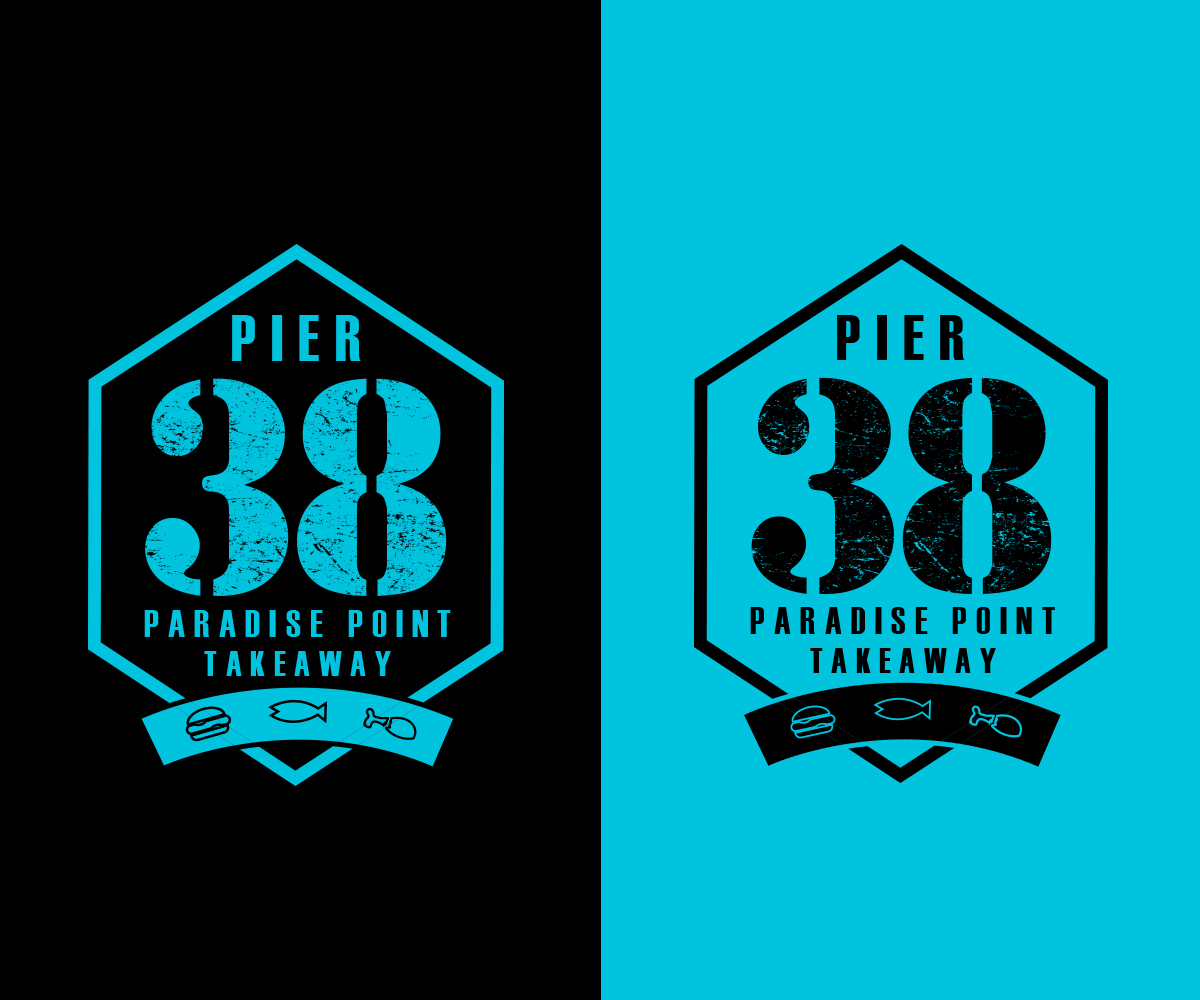
This customer received 49 logo designs from 22 designers. They chose this logo design from Thomas DeHart as the winning design.
Join for free Find Design Jobs- Guaranteed
-
 A$160
A$160
-
 49 designs
-
 22 designers
Logo Design Brief
We are re-branding a Takeaway Fish and Chips and Burger Bar. The new name is "Pier 38". We want our brand to be Up-Market Bold Clean and Crisp. Pier 38 will sell premium seafood, cooked and fresh and premium takeaway food. Crispy Southern Chicken and Burgers.
The new shop will be like a white washed timber shack with a printed mural of a Seascape on the wall (attached). The colours will be white and blues turquoise and green to match the mural. The shop is located on the water.
Target Market(s)
Everyone
Logo Text
Pier 38 Paradise Point Takeaway
Font styles to use
Sans Serif
Look and feel
Each slider illustrates characteristics of the customer's brand and the style your logo design should communicate.
Elegant
Bold
Playful
Serious
Traditional
Modern
Personable
Professional
Feminine
Masculine
Colorful
Conservative
Economical
Upmarket
Requirements
Must have
- Bold Impact
Files
Download all files - 1.4 MBJPG
shutterstock_114107182 Monday, 01 June 2015 04:15:47
Wednesday, June 3, 2015
PDF
PIER 88 - Digital Finishes Wednesday, 03 June 2015 02:05:09
Wednesday, June 3, 2015
Payments
1st place
A$160