The Network
Winner
Want to win a job like this?
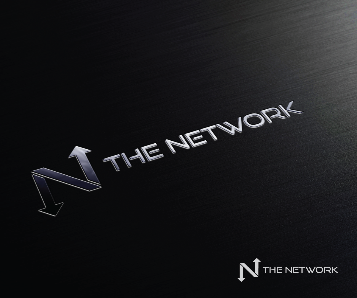
This customer received 70 logo designs from 26 designers. They chose this logo design from mariosigncom as the winning design.
Join for free Find Design Jobs-
 US$160
-
 70 designs
-
 26 designers
Logo Design Brief
The network is a real estate company that connects agents to clients. I would like to incorporate the "N" in Network to be our main symbol. A unique looking "N" would be nice. I would also like to have a symbol that emphasis network connecting people.
I have loaded two images that I like. I would like to see the "n" designed to look like the loaded images.
Target Market(s)
real estate buyers and sellers
Industry/Entity Type
Real Estate
Logo Text
The Network
Look and feel
Each slider illustrates characteristics of the customer's brand and the style your logo design should communicate.
Elegant
Bold
Playful
Serious
Traditional
Modern
Personable
Professional
Feminine
Masculine
Colorful
Conservative
Economical
Upmarket
Requirements
Must have
- gold and black colors or
- silver and black or
- Bright Blue
- orange
Should not have
- no teal or light blue colors
Files
Download all files - 0.0 MBJPG
real logo Friday, 29 May 2015 03:02:24
Friday, May 29, 2015
JPG
REAL ESTATE Friday, 29 May 2015 03:02:34
Friday, May 29, 2015
Payments
1st place
US$160