Private Practice Dietitian's Business Card
Winner
Want to win a job like this?
This customer received 32 business card designs from 8 designers. They chose this business card design from markiez as the winning design.
Join for free Find Design Jobs- Guaranteed
-
 A$170
A$170
-
 32 designs
-
 8 designers
Business Card Design Brief
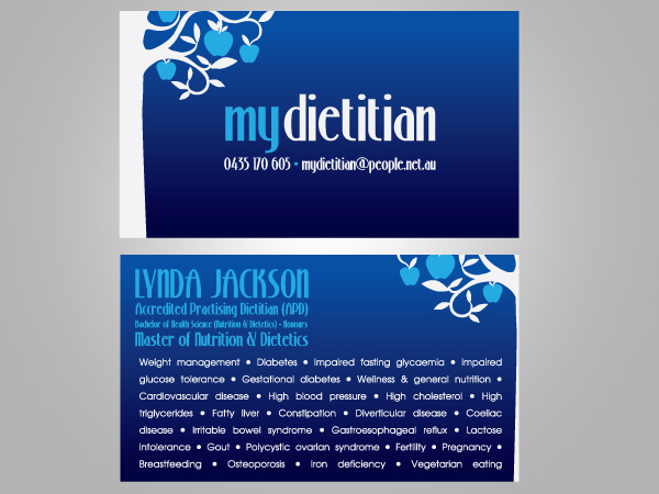
A 2-sided business card for a dietitian (medical nutritionist) in private practice within a natural therapies allied health clinic. The business card needs to imply warmth and professionalism.
Target Market(s)
Doctors who may refer patients to a dietitian and patients themselves who may request dietetic assessment, education and counselling.
Industry/Entity Type
Business
Look and feel
Each slider illustrates characteristics of the customer's brand and the style your logo design should communicate.
Elegant
Bold
Playful
Serious
Traditional
Modern
Personable
Professional
Feminine
Masculine
Colorful
Conservative
Economical
Upmarket
Requirements
Must have
- The business card must be an intense blue on the front at the bottom, gradually lightening towards the top of the card. Please see:
http://pinterest.com/zack_collings/business-cards/
for an example from "The miracle of mindfulness" book. I'd like an apple tree on the left with a pale silver/grey trunk (like the silver in the book cover)and branches that bends over to the right above the writing. Apples to be a turquoise/aqua colour similar to that in "The miracle of mindfulness" book cover. Front cover writing to read:
mydietitian
0435 170 605
mydietitian@people.net.au
'mydietitian' is one word but I would like the 'my' in turquoise/aqua to match the apples and the 'dietitian' and the phone number and email address in the pale silver/grey to match the tree trunk.
I'd like the mydietitian in larger font than the phone number and email address but for all 3 lines of text on the front of the business card to be stretched so they have the same left and right margin. (I hope this makes sense!)
I would like the back of the card to be white and the top section of text to be in the same turquoise/aqua from the apples on the front of the card and to read:
LYNDA JACKSON
Accredited Practising Dietitian (APD)
Bachelor of Health Science (Nutrition & Dietetics) - Honours
Master of Nutrition & Dietetics
This text should be stretched/compacted so that it all has the same left and right margin.
After this text there should be a blank line for spacing before the next section of text, which is to be in the silver/grey of the tree trunk. It should read:
Weight management
Diabetes
Impaired fasting glycaemia
Impaired glucose tolerance
Gestational diabetes
Wellness & general nutrition
Cardiovascular disease
high blood pressure
High cholesterol
High triglycerides
Fatty liver
Constipation
Diverticular disease
Coeliac disease
Irritable bowel syndrome
Gastroesophageal reflux
Lactose intolerance
Gout
Polycystic ovarian syndrome
Fertility
Pregnancy
Breastfeeding
Osteoporosis
Iron deficiency
Vegetarian eating
This set of text can run across the page from left to right and each medical condition could be separated from the next in some way to help with ease of reading. For example perhaps a space, dot and another space could separate the medical conditions. This set of text should be stretched so that the left and right margins of each line is the same. Thank you!
Nice to have
- An easy-to read but 'elegant' font would be nice - but I have no idea which one! Nothing too ornate, but not dull standard Times New Roman/Arial/Comic Sans either!
Should not have
- Times new roman/comic sans/arial fonts
Payments
1st place
A$150
Participation payments x 1
A$20