Sustainable San Mateo County wants to refresh our logo.
Want to win a job like this?
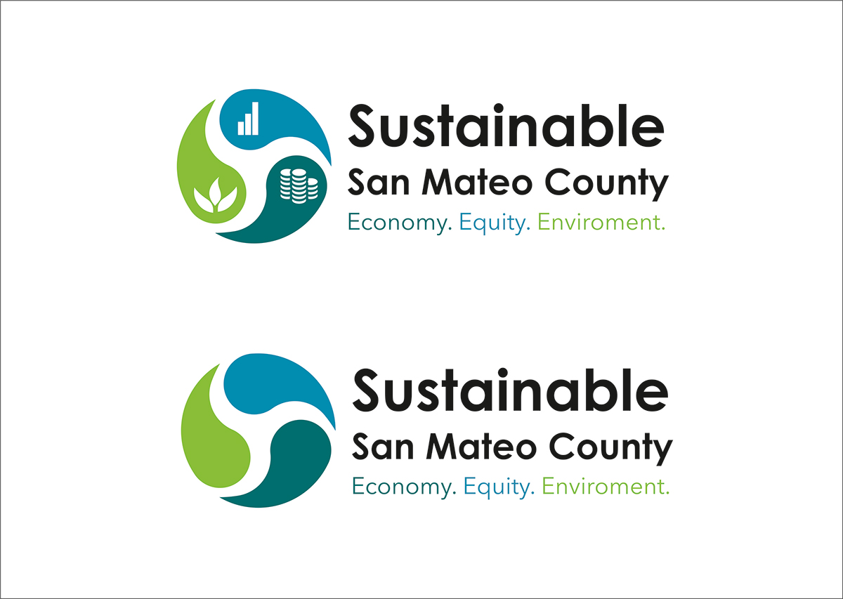
This customer received 49 logo designs from 17 designers. They chose this logo design from Abaan as the winning design.
Join for free Find Design Jobs-
 US$160
-
 49 designs
-
 17 designers
Logo Design Brief
We want to update our logo with a more modern design take on the current theme. We'd like to keep the same colors (detail below).
Background: Sustainable San Mateo County (SSMC) is a nonprofit established in 1992 by a group of San Mateo County citizens who sought to create a broader awareness of the sustainability concept.
Vision: Sustainable San Mateo County is dedicated to the long-term health of our county’s economy, environment and social equity.
Mission: To stimulate community action on economic, environmental and social issues by providing accurate, timely and empowering information.
Values: Fact-based Objectivity, Integrity and Transparency, Inclusivity, Intentional Collaboration, Local and Regional Impact-focused
Tagline: The Three E's: Economy, Environment, Equity. Note our current logo has this included and features a 3-piece puzzle design invoking the interconnectedness of these issues. Given our two main efforts, we have started to describe our work as "Information and Inspiration" - a line which has been very understandable and well-received and may play a more prominent role in our future communications/marketing.
Core Program: Indicators Report, a "report card" of metrics across the three e's meant to provide data to inform sustainable decision-making. The philosophy behind the report is "what gets measured, gets managed."
Our other main program is a Sustainability and Green Building Awards program/event meant to highlight exceptional local efforts and inspire the community.
Check out our website for more info (note that updating our website is one of our short-term goals after getting a new logo): www.sustainablesanmateo.org
Current logo colors:
Dark Teal:
Web: #016A6E
RGB: R=0, G=106, B=110
CMYK: C=90, M=42, Y=51, K=18
Light Blue
Web: #0688AE
RGB: R=6, G=136, B=174
CMYK: C=84, M=34, Y=20, K=1
Green
Web: #7CC242
RGB: R=124, G=194, B=66
CMYK: C=56, M=0, Y=100, K=0
Updates
Project Deadline Extended
Reason: Our Communications Committee - composed of Board Members and Volunteers - did not feel that we had yet found the right logo. Many of the designs submitted had elements that we liked but weren't quite the right fit. We are looking for modern unifying symbol, simple and elegant, indicating the overall idea of continuity and flow -- as opposed to individual symbols for the 3 tenants (economy, equity, environment). i.e. the puzzle of our current logo represents a larger concept, as opposed to an individual one - e.g.: equity. We hope that by extending the deadline and providing additional feedback to designers we can encourage additional submissions that achieve the look and feel that better represents our approach.
Added Wednesday, June 10, 2015
Target Market(s)
Local decision-makers, government leaders, agency staff, nonprofit and community organizations, activists and engaged community members, environmentalists
Logo Text
Sustainable San Mateo County
Font styles to use
Look and feel
Each slider illustrates characteristics of the customer's brand and the style your logo design should communicate.
Elegant
Bold
Playful
Serious
Traditional
Modern
Personable
Professional
Feminine
Masculine
Colorful
Conservative
Economical
Upmarket
Requirements
Must have
- we are looking for modern unifying symbol, simple and elegant, indicating the overall idea of continuity and flow -- as opposed to individual symbols for the 3 tenants (economy, equity, environment). i.e. the puzzle of our current logo represents a larger concept, as opposed to an individual one - e.g.: equity