SmarterMeasure Learning Readiness Indicator flyer
Want to win a job like this?
This customer received 33 flyer designs from 10 designers. They chose this flyer design from Sbss as the winning design.
Join for free Find Design Jobs- Guaranteed
-
 US$220
-
 33 designs
-
 10 designers
Flyer Design Brief
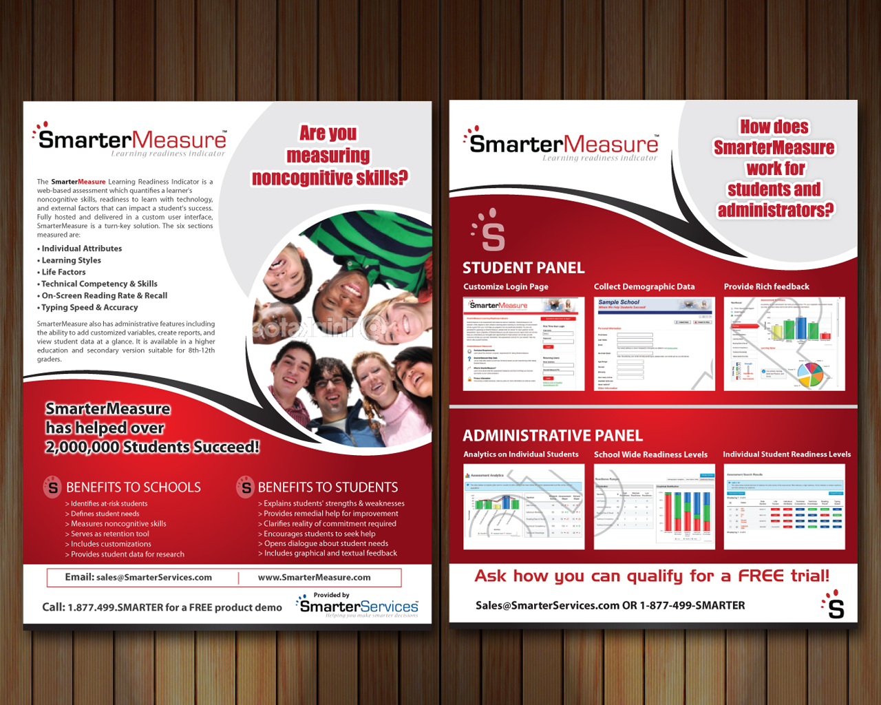
front and back one 8.5 x 11 pg. It should be similar in feel to the proof attached of our current flyer. For background you should go to our company site. you'll see we have 4 products all which have their own color. We are trying out one flyer but if we like it enough, then we'll use the same basic template for our other products. We want all products to have their own flyer but have the same basic look and feel BUT we are open to changing that way of thinking if it works. We will soon be redesigning our booth, web page and other literature. This is just a test for our main product flyer. I've uploaded a few extra files just to give you the look and feel of our overall sites and products. But this flyer is JUST for the ONE product SmarterMeasure and should include all of the same information as does the current flyer. You can change up the front and back using those screen shots. The tool is a web based assessment.
http://www.smarterservices.com/
http://www.smartermeasure.com/
Target Market(s)
Male/Female, all races, college degree holders, educational technology, higher ed, Dir of Student success at colleges, elearning depts
Industry/Entity Type
It Company
Look and feel
Each slider illustrates characteristics of the customer's brand and the style your logo design should communicate.
Elegant
Bold
Playful
Serious
Traditional
Modern
Personable
Professional
Feminine
Masculine
Colorful
Conservative
Economical
Upmarket
Requirements
Must have
- We'd like to have a picture of people with mixed races that represents college students (not just 18 yr olds but a mix of young and adult students) We like to have that personal feel. BUT we are considering only using the product screen shots instead. We are open to that change.
Company logo - SmarterServices (blue/black)
Product logo - SmarterMeasure Learning Readiness Indicator (red/black)
Company logo "S" stylized (red/black)
All files found at - http://www.smarterservices.com/images.cfm
Bullet points for easy reading - Benefits to schools (see attached current flyer)
Color should match red in logo
The flyer needs to have all the same info as the uploaded proof that we are currently using. We are just trying to get a new look
contact info
Nice to have
- clean lines which demonstrate conservatism and not modernism so we need clean lines looking neat and warm not clean lines looking cold and sterile...make sense?
We need a fresh take on what we are currently using for SmarterMeasure.
Polished, professional, and fresh.
Should not have
- no curly cues, decorative fonts that appear whimsical. do not use old fashioned fonts that look like type writer or plain ol' Times New Roman. But keep it clean, classic, and FRESH.