Energy drink design for music company - to be used at conference
Want to win a job like this?
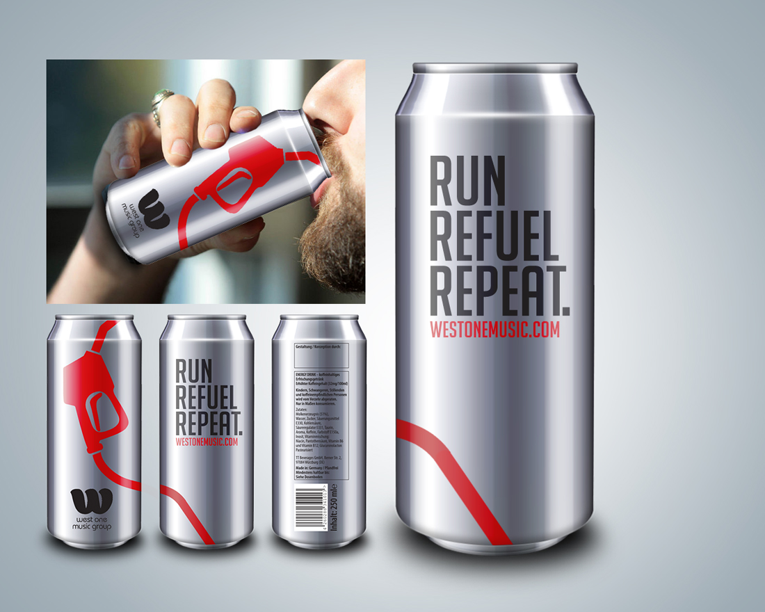
This customer received 2 print designs from 1 designers. They chose this print design from Alexbridgedidit as the winning design.
Join for free Find Design Jobs-
 €120
€120
-
 2 designs
-
 1 designer
Print Design Brief
We need a design for an energy drink (isotonic drink), which we'll give away at a conference.
We are a production music company working with creative people in the TV landscape. We are fun, easy going and professional at the same time. Our clients are partners for us and their happiness comes first.
The conference Eyes and Ears of Europe is targetted at TV producers and this years slogan is "Keep on running", because the TV landscape is changing on a daily basis due to digitalisation and the increased fight for audience.
Our energy drink (isotonic drink) design should relate to the "keep on running" slogan without make it too obvious (i.e. an outline of a runner). The idea is to catch ppl attention, without being typical advertisment. Colour-wise we'd like to move away from black. But the colour has to work with the silver can, because the printed foil is transparent. Our logo needs to be black or white, the website address needs to be westonemusic.com. The layout would probably be similar to last years layout, with a catch line on the front and a banner with more info.
Attached is the design instruction from the energy drink printing company in German (file 2), our logo in black and white (file 3 & 4), the design of last years energy drink (file 1) and a few of our brand images (file 5, 6 & 7).
Industry/Entity Type
It Company
Font styles to use
Other font styles liked:
- Museo (but not necessarily)
Look and feel
Each slider illustrates characteristics of the customer's brand and the style your logo design should communicate.
Elegant
Bold
Playful
Serious
Traditional
Modern
Personable
Professional
Feminine
Masculine
Colorful
Conservative
Economical
Upmarket
Requirements
Must have
- logo in black or white
- website address as westonemusic.com