Refine and finish Icon sketch to professional standards
Want to win a job like this?
This customer received 15 logo designs from 7 designers. They chose this logo design from TheyCallMeJenks as the winning design.
Join for free Find Design Jobs-
 €120
€120
-
 15 designs
-
 7 designers
Logo Design Brief
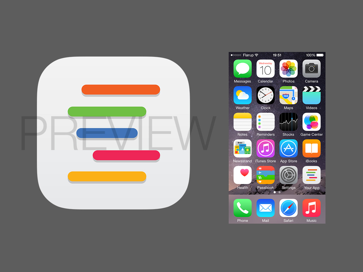
We’re looking for an iOS App Icon for an App that contains a calendar, that helps people to plan the use of shared objects. We already have a general idea of how the Icon could look like (see attached file ) . The horizontal lines on the sketch symbolize the bookings in a calendar. What we need is a graphically balanced and refined version oft the general idea. Please feel free to experiment with the basic idea and the color schemes, although we tend to like the color schemes promoted by flat ui (see color swatches here : http://designmodo.github.io/Flat-UI/ )
Formats required:
- Adobe Illustrator file
and
- PNG’s :
180 x180 px 120 x 120 px 152 x 152 px 76 x 76 px
1024 x 1024 px
You should avoid using interlaced PNGs. The standard bit depth for icons is 24 bits—that is, 8 bits each for red, green, and blue—plus an 8-bit alpha channel. You don’t need to constrain your palette to web-safe colors. (see http://apple.co/1mbvfmX )
restrictions:
- Icon style for IOS (no shadows, dropshadows, etc)
- For final file delivery the icons have to have unrounded corners (see apple human interface guidelines )
When iOS displays an app icon on the Home screen of a device, it automatically applies a mask that rounds the corners. Make sure the icon has 90° corners so it looks good after the mask is applied.
You can find all this details here : http://apple.co/1qymFjZ
Industry/Entity Type
It Professional