30 y/o Skydiving Dropzone needs a logo that speaks to our next generation of skydivers
Want to win a job like this?
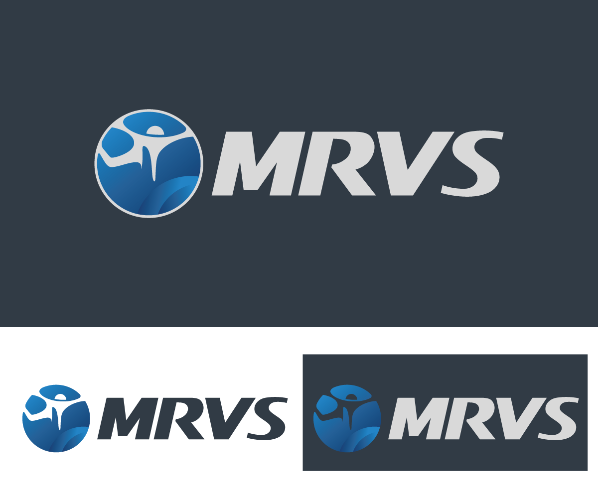
This customer received 100 logo designs from 19 designers. They chose this logo design from sourgraping as the winning design.
Join for free Find Design Jobs- Guaranteed
- Bundled Project 1
-
 US$570
-
 100 designs
-
 19 designers
Logo Design Brief
UPDATED 140221Z: ***Of the 45+ designs we only have 9 designers! There are only 3 designs in contention thus far.*** We are new owners of a 30 year old skydiving dropzone. We provide tandem skydives as well as training to become a solo skydiver. The previous owner became jaded over the years and the business suffered for it. We are trying to breathe new life into a dying business and also, what is sadly, a dying sport. We have noticed that designers are surprised by the verbose feedback we provide on each design (re)submission. Do you want to be part of a project where you are engaged with us at every change; one where we tell you like it is, good and bad; where you get a reason why we like or dislike something? Come join ours!
The logo needs to be a vector graphic with 6 colors or less, though preferably 4 or less. Partial to greens but we have started to learn in the first two days of this project that it may be a bad choice in general; especially with the primary colors of the website. The website will be a blue with the darkest of blue backgrounds. We need a logo that makes it obvious we aren't the old business any longer. That we are getting rid of the old and updating. One that "speaks" to a new generation of skydivers in their mid 20s to early 30s. It should attempt to engender a sense of as many of the following in order of importance: trust, professionalism, excitement, speed, the adrenaline rush. Obviously looking for something unique, don't want to think that I can build it using an online logo template. One of the owners has a thing for his Chinese Zodiac sign of the Dragon. If you can work it in without it looking silly, bravo! But please don't get hung up on it, YOU'RE the designer. Oftentimes it takes a designer to tell us what we really want; but don't get cocky ;)
Attached files will be mostly pictures intended to inspire. All pictures are taken from the web and are not owned by this business. You will also find a "mind map" about the logo, as well as an example of primary and secondary colors on what will be the new website. Not sure how helpful the mind map will be.
Looking forward to what we understand is to be some amazing creativity. Thank you ahead of time for helping us begin to rebuild this business and also for helping to keep skydiving alive. Thank you!
Target Market(s)
Looking for new skydivers. These are typically men (and some women) in their mid 20s to early 30s.
Industry/Entity Type
Skydiving
Contact Information for Business Card
Looking for something minimalist. Would like a way to scan for information on the back. Not just a blocky black and white QR code. I've seen some amazing QR codes out there.
Logo Text
MRVS
Logo styles of interest
Emblem Logo
Logo enclosed in a shape
Pictorial/Combination Logo
A real-world object (optional text)
Abstract Logo
Conceptual / symbolic (optional text)
Lettermark Logo
Acronym or letter based logo (text only)
Font styles to use
Other font styles liked:
- Surprise us with your creation!
Look and feel
Each slider illustrates characteristics of the customer's brand and the style your logo design should communicate.
Elegant
Bold
Playful
Serious
Traditional
Modern
Personable
Professional
Feminine
Masculine
Colorful
Conservative
Economical
Upmarket
Requirements
Must have
- Must be in vector format, with the ability to recreate it if necessary. Don't fear some detail. 6 colors or less, but 4 preferably. Colors should not clash with the website; please see the files called: 'colors website primary' & 'colors website secondary'. MRVS somewhere in it. A feeling of renewal; out with the old in with the new. Purvey a sense of professionalism and trustworthiness. Very important: a person should have a general idea of what the business is by seeing this logo up close once; then they should quickly recognize the logo from a distance a week later only seeing it for the second time. In short, quick comprehension up close, engaging enough to remember a week later.
Nice to have
- Would be nice to look at the logo and think, excitement, fast, adrenaline rush. Sleekness would be nice. Love the use of negative space. If you can incorporate a reserve pin, dragon or both somehow without looking ridiculous... Bravo!
Should not have
- No raster graphics. Should not be anything like the IBM logo; as that was an inspiration for the previous amateur logo. Nothing that could be misunderstood for a bird of prey (hawk, eagle, etc), as there is another skydiving business named "Falcon Skydiving".
Files
Download all files - 2.6 MB
Payments
Total
US$570
Project Deadline
17 Apr 2015 18:53:59 UTCProject Upgrades
Bundled project(s)
- offering US$80 business card design to winner